Perfect in Pastels…

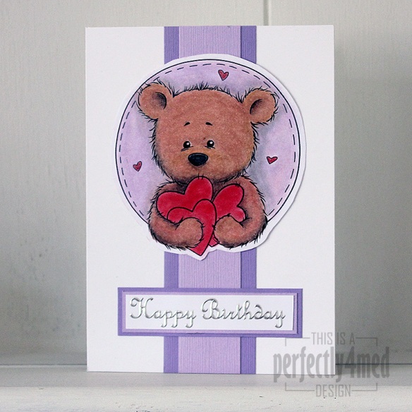
Bundle of Hearts in pastelsIt’s ‘Let’s Celebrate’ theme over at The Crafting Cafe this month, and for my DT post I chose the fantastic ‘Bundles of Hearts’ digistamp from , their sponsors this month.

I had a go at being a bit different, and decided to try and make the equivalent of an embossing folder to build up the image into an embossed one – it worked to a degree, but no where near good enough to run with, and then I ran out of time.

So I got out the PanPastels to colour in Benson Bear, adding shading and filling in the small areas with Derwent soft pastel pencils. I blended those in with a paper stump, which was also quite handy for moving the pastel off the laser-printed black areas. Any pastels running over edges were gently rubbed back with an eraser. I used a spray fixative to seal everything before assembling the card. The sentiment is a peel off, and the coloured card from Bazzill. I love the texture that the pastels give to the fur 🙂

And once I’ve mastered the art of converting a digistamp to an embossed image, I’ll let you know!


Seasonal Colour Palette – Dove of Peace

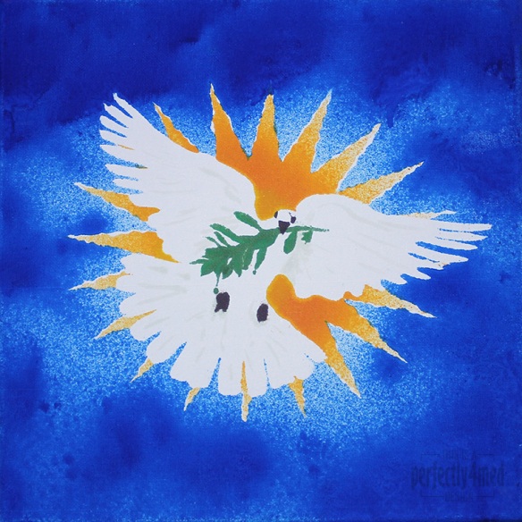
I like a challenge… and I like it even more when I get inspiration, have the materials, and more importantly can snatch a moment to get the piece done. So it is with some delight that I share with you my entry to the Ranger Ink ‘Seasonal Color Palette’ Challenge: to create any project using the theme colours based around the Adirondack Color Washes in Butterscotch, Meadow, Espresso and Sailboat Blue. It’s a 12×12 inch canvas:

Color Wash Dove

From concept to final outcome took approximately 3 hours, with only two hours of hands-on crafting. I started by using Adobe Illustrator to produce an outline of the starburst, dove and olive branch, printing it out four times. Each copy was then sprayed with fixative spray to seal it, which stopped the colour wash bleeding through. I cut out the various items to produce stencils – the central outline, the eyes and beak, the branch, and then the starburst ‘prongs’. I used repositionable spray glue to coat the back and adhere the stencil firmly to the canvas before spraying each of the colours on in turn, using a heat tool to dry and heat set between colours. Aside from a bit of overspray and bleed, and a little stencil misalignment, I’m quite pleased with the result. I did a little touching up here and there with some of the Distress Paints, which may be hard to see as they picked up some of the dye layers beneath.

College – Term 6 – Final Major Project – another light shade

It’s another light shade, this time featuring cut-outs using silhouettes based on my own observational drawings. I’ve cut the silhouettes from heavy interfacing, used Bondaweb to fuse to a layer of white cotton, and then machine stitched them onto the card frame.


And this afternoon, I spent a couple of hours in a darkened room. The stress hadn’t got to me (though the same can’t be said for our tutor this morning!), but the need to photograph all my creations to date had. Here’s a selection:

lampshadewpheader.jpg

I’m a Certified Powertex Trainer!

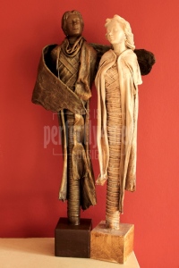
Yesterday, I had a very pleasant day workshop with Brit from Powertex British Isles. Powertex is a range of products based round a liquid fabric hardener. Having completed the workshop, I’m now certified to train you how to make figurines such as these:

Guardian Angel

They are 19 inches high, and constructed from wood and plaster formers, foil, masking tape, pressed mulberry fibres and old t-shirts all coated with Powertex and pigments. Let me know if you’re up for a training session in my new studio later in the year!

College – Term 5 – Final Major Project – Paper crafted light shades

It’s already March, and only two weeks before we finish Term 5. One more term to go, and that’s my college course done and dusted. If it weren’t for my new studio to look forward to working in, and the list of jobs to do in the house, I know I would be dreading the end of college. Though I was unwell last week, I did carry on with my final major project. It’s grown out of looking at Islamic geometric patterns – I’ve learnt to construct geometric shapes with a compass and ruler, transferring them into Illustrator, and then finally applying them to 3D polyhedra. I settled on a truncated cuboctohedron as my main construction, and played about with various construction techniques.

Here are just four of the anticipated dozen final pieces. Some are uninspiring in daylight, but come alive when internally lit. Others inspire in both lights. I can tell you that I got a blood blister in my finger tip from all the scoring of folds. I can reveal that the shadowfold light required 360 separate knots. And that I stuck down each of the 400 petals on the frilly one! All are handcrafted (though I did use the Cricut machine to cut out the shapes to my design!) and nothing more than fabric or paper and glue. They are roughly 6-7 inches in diameter and designed to sit over an inexpensive battery powered LED light (£1 for two in Poundland!).

College – Textiles – Term 4 – Final Project

The choice of final project in textiles was to either design and make three tea towels, an apron or a Cornell-style fine art box. I followed my ceramics theme and chose the box, and thus embarked on a project to include every technique I could think of to transfer my patterns from my sketchbook to my ‘panoply of patterns’. Here’s the completed box, complete with my display sheets displaying its contents:

Completed-box---closed


Lots of techniques in here, from free hand drawing with a fabric gel pen, to free motion machine stitching, backstitch hand embroidery, iron on transfers, applique, fabric paint and quilting to name but a few…

College – Print – Term 4 – Final Pieces

This term in my print lessons I’ve revisited dry point – with a new twist which I hope to develop and share in due course… And then there was the lino cut – it turns out that lino is a lot easier to carve when warm, but crumbles when hot… And there was the collagraph – sticking items to a piece of card, liberally coating with PVA and allowing to dry before using it as a print plate. Part of the final project is to take prints that aren’t quite exhibition standard and embellish them a little:


Here’s the before and after of a piece of serendipity – I was washing out my large screen with a large repeat pattern on it, and the water/ink mix was caught by the scrap paper beneath – I loved the texture and distressed colours. I embellished it with watersoluble graphite pencil and a bit of frottage on sandpaper to add texture, and a distress ink mix to tone down the white paper:


Finally, I wanted to play around with a repeat pattern on a large scale… the screen alone was two feet square – and I chose to run off a couple of lengths of wallpaper as well as a couple of multicoloured prints:

Not sure that I’d want that repeat in black and white across the chimney breast!


College Course – Painting – Week 5

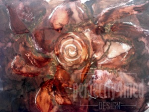
I’ve just been reviewing my myriad pictures and realised I hadn’t posted my favourite painting of the session so far – it was completed before half term. We worked relatively large scale (I think this was on A3 size paper) and were encouraged to be free in our movements with the brushes. It’s painted with watersoluble inks, resisted by oil pastel outlines and highlights, and I moved the inks around after application by flooding areas with water. A bit of thinned PVA adds shine, as well as more ink movement. I think the result is rather abstract, very free, and still resembles the rose bead I was using as a reference!

College Course - Painting - Week 5

Playing with PanPastels in a new art journal

One of the benefits of working at the NEC during a craft show is nipping off during breaks and spending money on new materials. This time I went mad and treated myself to the 20-colour PanPastel Portrait Set, mainly for my life drawing work at college obviously. However, I do need to get used to them, so last night I played with them, setting down dry wash backgrounds in a new art journal that I’m dedicating to work with pastels. A quick spritz with fixative spray and here’s how it went:

I love the vibrancy of the pigment-rich colours, and found that they played nicely together when swiped over with any of the tint colours – until then, there wasn’t that much interplay between the colours, but I may have been a bit stingy with the initial application. I applied the PanPastels using a large Sofft sponge.

They’re not tangle patterns… but they’re close!

Me again – I’ve survived a three day stint demonstrating and teaching at the NEC Hobbycraft exhibition, and it’s back to college and catch up time! Last week we were set loose to develop our own style in our drawing lessons, and I’ve returned to making repeating patterns from elements of my bead collection. Each of these patterns are A4 in size, in my sketchbook, and have been painted with black acrylic ink. They are all based on the same shapes which I have cut out from a preceding pattern, rearranged and then traced onto the page before block colouring. They’re not tangle patterns… but you could still use them in your zentangles…


Continue reading