Dear reader, you may recall that I’m not a fan of ‘anything goes’ card challenges. Many entries to the two challenges I contribute to are not clean and simple, despite this remaining a requirement of the ‘anything goes’ theme. Well, this week at Less is More, we have our monthly ‘anything goes’ challenge – do play along with us, but keep your design clean and simple! Without a defined subject matter, I struggled to get inspiration but came up with this sympathy card after rummaging through some unused die sets:
Tag Archives: dove
Tutorial: That’s Crafty! Art Shrine
I don’t know how much of this art shrine sample was shown on TV last week… I certainly didn’t have enough time to demonstrate how I put it together, so here comes a tutorial to follow if you want to make your own 🙂
Seasonal Colour Palette – Dove of Peace
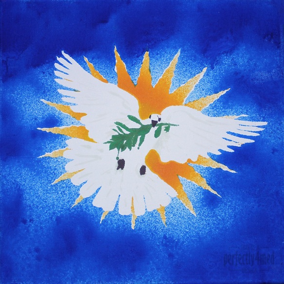
I like a challenge… and I like it even more when I get inspiration, have the materials, and more importantly can snatch a moment to get the piece done. So it is with some delight that I share with you my entry to the Ranger Ink ‘Seasonal Color Palette’ Challenge: to create any project using the theme colours based around the Adirondack Color Washes in Butterscotch, Meadow, Espresso and Sailboat Blue. It’s a 12×12 inch canvas:
From concept to final outcome took approximately 3 hours, with only two hours of hands-on crafting. I started by using Adobe Illustrator to produce an outline of the starburst, dove and olive branch, printing it out four times. Each copy was then sprayed with fixative spray to seal it, which stopped the colour wash bleeding through. I cut out the various items to produce stencils – the central outline, the eyes and beak, the branch, and then the starburst ‘prongs’. I used repositionable spray glue to coat the back and adhere the stencil firmly to the canvas before spraying each of the colours on in turn, using a heat tool to dry and heat set between colours. Aside from a bit of overspray and bleed, and a little stencil misalignment, I’m quite pleased with the result. I did a little touching up here and there with some of the Distress Paints, which may be hard to see as they picked up some of the dye layers beneath.


