Art Journal Page: What to write

Art journal page: what to writeI don’t experiment much in my art journal any more, which is a shame. I have developed a style and, generally, keep to it with occasional variations. This week, I was inspired by the work of one of my colleagues at That’s Crafty!, Lynne Moncrieff. She has a wonderful grunge style that uses nature as inspiration, developing textures and colours from natural inks, pigment crystals and sprays.

So I raided the tea bag waste bin for old tea bags and reached for the sprinkles. And learnt that I need to do far more experimentation with both! The pages started to come together with the various bits of ephemera and using some tea bag paper to mount them on. It finally knit together with a healthy dose of vintage photo distress ink and oxides.

But what to write? Well, having done so, I wish I hadn’t! I found a fountain pen and filled it with sepia ink – but of course, it didn’t really like the gessoed page. Tracing over it with a cocktail stick dipped in the same ink gave a much better finish, so next time I’ll go straight to that. I recovered slightly by spritzing with water – the smudging and feathering is now deliberate rather than accidental 😉 Continue reading

College Course – Painting – Week 5

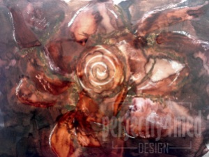
I’ve just been reviewing my myriad pictures and realised I hadn’t posted my favourite painting of the session so far – it was completed before half term. We worked relatively large scale (I think this was on A3 size paper) and were encouraged to be free in our movements with the brushes. It’s painted with watersoluble inks, resisted by oil pastel outlines and highlights, and I moved the inks around after application by flooding areas with water. A bit of thinned PVA adds shine, as well as more ink movement. I think the result is rather abstract, very free, and still resembles the rose bead I was using as a reference!

College Course - Painting - Week 5

Life Drawing – more from Term 2

That’s another block of life drawing finished! This term we’ve looked at the paintings and sculptures of Antony Gormley and used wax and ink to paint the human form. This is the second piece from Week 2 – I’ve already posted my work from Week 3 here. I’m particularly pleased with the crouching figure. Many thanks to our model for his fortitude!

This second image is the result of a four 40 minute sittings over two weeks, starting with a measured outline, then addition of oil pastels for colour using David Bomberg’s paintings as an influence. In the second session, we then broke down the oil pastel with turpentine before adding the background and working into the figure more. The figure isn’t dark enough with the addition of the background, so some of the form is lost as a result. Many thanks to our model for allowing me to share the image (and for sitting so patiently!).

College – Week 1

Well, I’ve survived my first week in full time education in 22 years! Monday saw our introduction to Jewellery – we started with a design sheet and learning various techniques. The afternoon was spent starting to explore ‘line’ in contextual studies. On Tuesday we started looking at the print workshop and more drawing exercises, with the afternoon being introduced to our contextual studies in Art Nouveau (we’re doing an art journal for this one, yay!). And on Friday we looked at graphic design with emphasis on illustration, with even more drawing. Anyone would think that we’re on an art course 😉

Jewellery - Week 1 - pencil, pen and water, mark making with ink and PVA, fine liner, metal impressing and hammering

Graphic Design - Week 1 - preliminary sketches