I had the privilege of hosting three of the church’s young people’s group (in other words ‘yoof’) last night in The Studio. We had two hours to work on a project, so I rummaged in my ‘for altering’ drawer and lifted out some Ikea Malma mirrors that were collecting dust. I also dusted off a technique I learnt years ago and came up with an altered art project.
Tag Archives: adirondack
Scent-sational Apertures (for Creative Expressions)
 Also in my DT pack this month are two more Singles stamps featuring cut-glass bottles or perhaps they could be decanters – Crystal Cut and Murano Glass. Both are two stamp sets – the bottle and a ‘scent-iment’. I wanted to highlight the glass element, so created two cards using apertures and acetate. Clean and simple designs, they show off the stamps wonderfully. Oh, and don’t make the same mistake as me: remember that the image on the front of the pack is not actual size… That’s how I ended up with the ‘close up’ in the aperture!
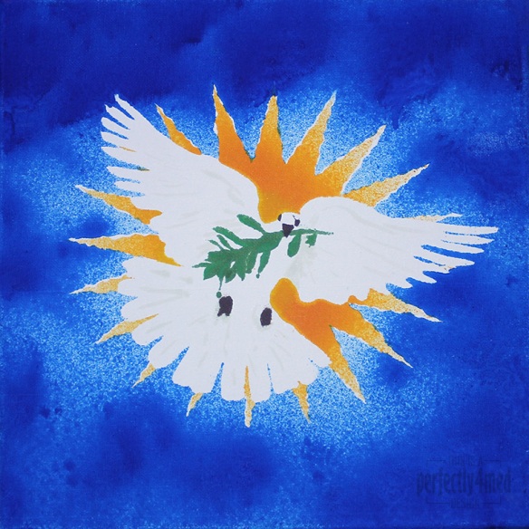
Seasonal Colour Palette – Dove of Peace
I like a challenge… and I like it even more when I get inspiration, have the materials, and more importantly can snatch a moment to get the piece done. So it is with some delight that I share with you my entry to the Ranger Ink ‘Seasonal Color Palette’ Challenge: to create any project using the theme colours based around the Adirondack Color Washes in Butterscotch, Meadow, Espresso and Sailboat Blue. It’s a 12×12 inch canvas:
From concept to final outcome took approximately 3 hours, with only two hours of hands-on crafting. I started by using Adobe Illustrator to produce an outline of the starburst, dove and olive branch, printing it out four times. Each copy was then sprayed with fixative spray to seal it, which stopped the colour wash bleeding through. I cut out the various items to produce stencils – the central outline, the eyes and beak, the branch, and then the starburst ‘prongs’. I used repositionable spray glue to coat the back and adhere the stencil firmly to the canvas before spraying each of the colours on in turn, using a heat tool to dry and heat set between colours. Aside from a bit of overspray and bleed, and a little stencil misalignment, I’m quite pleased with the result. I did a little touching up here and there with some of the Distress Paints, which may be hard to see as they picked up some of the dye layers beneath.


