Art Journal Page: Pictures [Pick A Stick Challenge]

#PASC416

I’ve taken the opportunity today to complete this month’s Pick A Stick Challenge. Ten steps, in order, mixing up the media and adding collage elements. There are more and more taking part in the challenge, and it’s the perfect way to journal when the artistic muse has wandered off.

Continue reading

What I did at the weekend…

IMG_5893_wThis gorgeous bird started out as a £1 plain brass charm at the start of Saturday morning. It’s only 7x5cm in size, but had the dimples ready for the cloisonné effect additions of Stickles Glue (Stardust, Peacock & Lagoon), Juniper Liquid Pearls and some Glossy Accents. So by the end of Sunday, this was the final result. I need to make sure I get to the rest of them, so I’m staying quiet as to where I found it!

I also completed two more art journal pages – another for my Carabelle Studio stamps demo, and the second featuring new stamps from Tim Holtz. This page had several layers of paint and distress stains to start, and then I augmented it with the ‘Pretty Like A Flower’ stamp, with distress markers. It’s the first time I’ve used PanPastels to tone down a background, fixing with a quick hairspray. Which by the way causes archival ink to swim about, so the gesso layer got thicker to cover that learning moment…

IMG_5891_w

Iridescent watercolours really make the embossed butterfly zing – but beware when drying the previous page – the embossing remelts and distresses both the artist and the facing page somewhat!
IMG_5880_w


Walk In The Son – Art in Worship

I was asked by a friend to help illustrate his message for the evening service at Whetstone Baptist Church last Sunday evening. He used passages from Psalms to describe David’s fall from kingship through despair in a dungeon, to feigned madness and then freedom and release. We were then invited to visualise and recall a walk in the sun, how it felt, and then we were told facts about The Sun itself. Alex then compared the darkness to his faith a couple of years ago to walking in the light now – and moved onto passages from John describing how it is to walk in the light of God.

My illustration used PanPastels as they blend and overlay so well, working onto A3 white card and filmed using an overhead webcam shared to the church projectors via laptop. Unfortunately, I didn’t work out the technology enough to record as I went, so I only have the final still to share. I started by adding a grey swirl around the outside as the walls closed in round David, adding yellow in the centre as the glimmer of escape came. As the description of the sun played out, I added the blue skies, built up the centre and erased the circular lines and the rays. We used a play on words to initially ‘walk in the sun’ as we were visualising that, and then as we moved on, I erased the figure bit by bit, adding the head and hands just before the climax of the illustration changing the ‘u’ to an ‘o’:

IMG_5514_w

Feedback from this first time attempt at live illustration was very positive, and from my point of view, it all worked well! Some top tips: work with the preacher to hone the order of things, especially if the image develops from a previous layer; definitely rehearse timings with something so tied to the sermon material; know your technology and check it’s doing what you expect; and be prepared to go for it 🙂


Play time with PanPastels

I’ve done a bit of housekeeping on the blog, so that it should now be easier to find things using a more obvious menu system. I’ave also added a ‘reviews’ page under the Workshops tag so that you can read what others have given as feedback about my classes.

And I’ve allowed myself a play day day to experiment with techniques. First on the list was to build on my PanPastel Art Journal that I started a while back with some backgrounds. I’ve recently bought new stamps from Designs by Ryn and Catslife Press that have sat in the drawer unloved and unused – and they are perfect for art journaling. I was also delighted to expand my PanPastel collection with a set of metallics for Christmas (thanks Kathryn & David!). Here’s what I came up with this morning:IMG_4358_wHere’s a time lapse showing the layers building up:

If you’d like more information on how to art journal with PanPastels, come along to my art journaling workshop on 3rd May! Here are a few more pages done this afternoon – unfortunately the metallics don’t show up very well on these scans:


Perfect in Pastels…

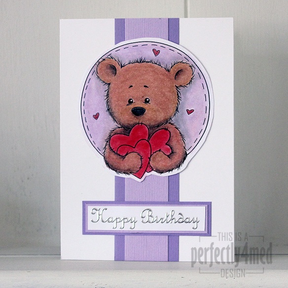
Bundle of Hearts in pastelsIt’s ‘Let’s Celebrate’ theme over at The Crafting Cafe this month, and for my DT post I chose the fantastic ‘Bundles of Hearts’ digistamp from , their sponsors this month.

I had a go at being a bit different, and decided to try and make the equivalent of an embossing folder to build up the image into an embossed one – it worked to a degree, but no where near good enough to run with, and then I ran out of time.

So I got out the PanPastels to colour in Benson Bear, adding shading and filling in the small areas with Derwent soft pastel pencils. I blended those in with a paper stump, which was also quite handy for moving the pastel off the laser-printed black areas. Any pastels running over edges were gently rubbed back with an eraser. I used a spray fixative to seal everything before assembling the card. The sentiment is a peel off, and the coloured card from Bazzill. I love the texture that the pastels give to the fur 🙂

And once I’ve mastered the art of converting a digistamp to an embossed image, I’ll let you know!


Playing with PanPastels in a new art journal

One of the benefits of working at the NEC during a craft show is nipping off during breaks and spending money on new materials. This time I went mad and treated myself to the 20-colour PanPastel Portrait Set, mainly for my life drawing work at college obviously. However, I do need to get used to them, so last night I played with them, setting down dry wash backgrounds in a new art journal that I’m dedicating to work with pastels. A quick spritz with fixative spray and here’s how it went:

I love the vibrancy of the pigment-rich colours, and found that they played nicely together when swiped over with any of the tint colours – until then, there wasn’t that much interplay between the colours, but I may have been a bit stingy with the initial application. I applied the PanPastels using a large Sofft sponge.