Over the last two days, I’ve had a sewing project on the go… a quilted day bag. The pattern is from our trip to Canda and is available from Lazy Girl Designs. It’s not the first bag I’ve made, but even so, it took some effort to follow the instructions properly (operator errors, the instructions were actually pretty clear…). The pattern calls for quilting cotton fabrics – I chose a heavier weight printed canvas for longevity. I’ve also learnt from previous experience and on finishing it, liberally sprayed it with Scotch Gard fabric protector. It will be washable though. Fabrics from Thimbles Fabrics & Crafts. Finished size: 12″ x 6″ x 10″. Total make time approx. 8 hrs, materials £40.
Tag Archives: canvas
Commission: These Boots
Building on my recent commissions, I’ve had another commission to do a further painting. This one is to distract from the side of a cupboard installed in a boot (utility) room. The picture will be face-on as you enter the room from the kitchen area.
So when it came to subject matter, it seemed obvious to use the boot as a theme. Wellingtons aren’t particularly in keeping with the area, but being on the edge of Snowdonia, walking/hiking boots seemed very apt. I’m fond of the recent trend toward including typography in images, and a classic lyric popped into my head…
Continue reading
Commission: Castle Series, no. 6 – Beaumaris
Here’s the last of my six castle paintings – the half-finished Beaumaris Castle. That’s the castle, not the painting that’s half finished… And, of course, the last was the trickiest! There is something to be said for having a good artist’s sketchbook, having the time and patience to use it and then apply what has been learnt onto the canvas. I don’t ‘do art’ quite like that…
Previous paintings in the series:
Caernarfon – Raglan – Criccieth – Dolwyddelan – Conwy
Continue reading
Commission: Castle Series, no. 5 – Conwy
With the same immenseness as Caernarfon Castle, Conwy is going to be a good balance in the room. With the suspension bridge, modern meets historical – and was most tricky to paint!
Previous paintings in the series:
Caernarfon Castle – Raglan Castle – Criccieth Castle – Dolwyddelan
Continue reading
Commission: Castle Series, no. 2, Raglan
I’ve been painting again today – after I’d potted on my leeks… This time, I’ve gone for Raglan Castle, in Monmouthshire. You might note, in comparison to my painting of Caernarfon Castle yesterday, that the light is coming from the opposite direction. There is method in this madness – the paintings are to hang opposite each other on either side of the room. Thus, the light, and the shadows, will look as if they are from the same direction.
Ok, ok, it was a happy accident that I noticed the above before I started hanging the paintings. Now I will go back to my reference materials and check that the remaining four of the series are split 50/50 in light direction. It was one of those ‘oh no’ moments that turned into ‘well, of course, I meant to do that’ when no one was looking…
Continue reading
Commission: Castle Series, no. 1, Caernarfon
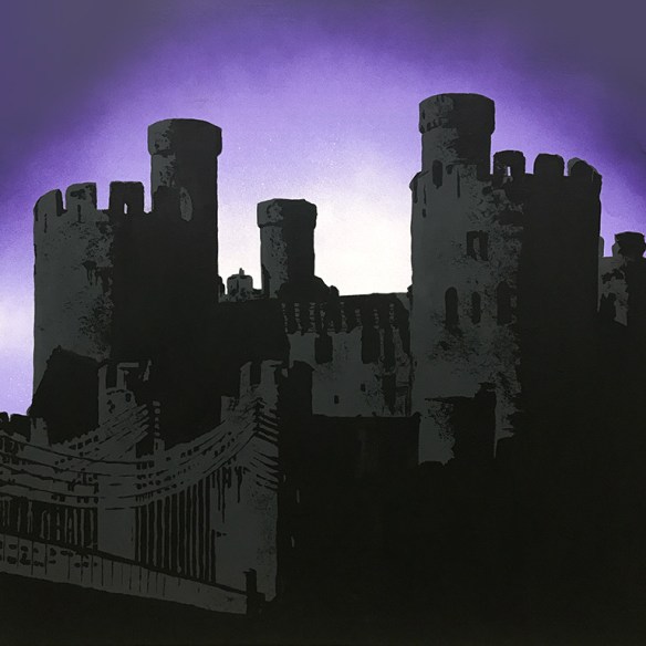
I’m having fun in the Studio, actually playing with paints and canvases for a change. It’s also been a little while since I have had any commissions. This is the first in a series of six canvases, each requested to feature a Welsh castle. The main colour of the room is grey, and the accent colour is purple.
I’ve loved the ‘purple twilight’ type photo treatment, and there’s nothing more striking (I think) than a castle’s silhouette. It gives a much more solid appearance, and given most castle’s prominence on the horizon, a real immenseness.
 My first is that of Caernarfon Castle. It took me a couple of tries to get the tonal shades right – my first go didn’t have enough contrast between the grey and black.
Continue reading
Altered Art: After Magritte
On a recent trip to Norfolk, I was lucky enough to get to a very reputable cigar and pipe shop and bought my first Meerschaum pipe. For those not in the know, these are carved from a white mineral, and naturally colour as they bake with successive smokes. They’re not cheap, and to keep them safe, they come in bespoke cases. They’re particularly handy for smoking outdoors as they don’t burn through like wooden ones can when wind keeps the embers constantly alight. Imagine then my horror when on first smoke there was a sudden crack noise, and the bowl left the stem.
It seems that every now and then, there are flaws in the mineral that aren’t obvious, and being quite thin walled, the pipe just gave out. The dealer replaced it with absolutely no fuss and I’m pleased to say the replacement pipe is giving me a great deal of pleasure as I have my downtime.
Long story cut short – I now had a pipe case with no pipe. It was too nice to throw away, but not easy to find another use for. I remember seeing Magritte’s ‘Treachery of Images’ and loving the surrealist observation decided to make my homage. Thanks to a friend who is considerably more knowledgeable about French than I am, I was able to add my own tagline: ‘This is not a pipe either’. I plan to send the canvas to the great guys who dealt with me so helpfully, and hope they (and their customers) enjoy the joke.
[Acrylic on canvas, Liquid Pearls Onyx, found object. 20cm x 20cm]Love is… tarmacing
 It’s a lurve theme over at The Crafting Cafe this month, and the DT got to work with digistamps from the fabulous Bugaboo Stamps. Ava and Deacon’s Love Word was perfect inspiration for this 12×12″ canvas board layout. I coloured the image with ProMarkers and the board with acrylic paints and added my new favourite tarmac technique. For a bit more detail, see my post at The Crafting Cafe.
Seasonal Colour Palette – Dove of Peace
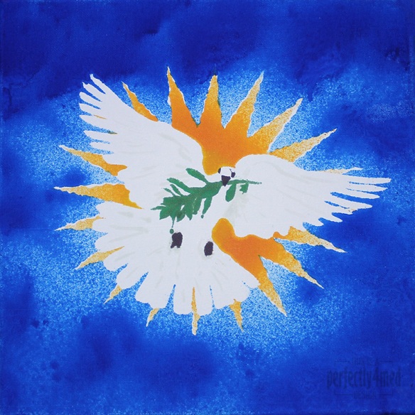
I like a challenge… and I like it even more when I get inspiration, have the materials, and more importantly can snatch a moment to get the piece done. So it is with some delight that I share with you my entry to the Ranger Ink ‘Seasonal Color Palette’ Challenge: to create any project using the theme colours based around the Adirondack Color Washes in Butterscotch, Meadow, Espresso and Sailboat Blue. It’s a 12×12 inch canvas:
From concept to final outcome took approximately 3 hours, with only two hours of hands-on crafting. I started by using Adobe Illustrator to produce an outline of the starburst, dove and olive branch, printing it out four times. Each copy was then sprayed with fixative spray to seal it, which stopped the colour wash bleeding through. I cut out the various items to produce stencils – the central outline, the eyes and beak, the branch, and then the starburst ‘prongs’. I used repositionable spray glue to coat the back and adhere the stencil firmly to the canvas before spraying each of the colours on in turn, using a heat tool to dry and heat set between colours. Aside from a bit of overspray and bleed, and a little stencil misalignment, I’m quite pleased with the result. I did a little touching up here and there with some of the Distress Paints, which may be hard to see as they picked up some of the dye layers beneath.
Creative Chemistry 101 – Day 8

Today we looked at a ‘Paint Primer’ – and I discovered a number of Snow Cap dabbers that were solid… and I only have the Rock Candy (clear) Crackle Distress paint. But I persevered and here are my homework tags:
I’m not sure about the acrylic resist on canvas in the centre – it really didn’t work out well, and I suspect I need more contrast on the background to make the yellow and pink dots stand out more. The Shattered Stains technique though is going to become a favourite!


