3D Projects
Altered Art: My ‘Sit & Be’ Windchime

I was once asked by a therapist if I could just ‘sit and be’. Back then, it was a concept that made no more sense than someone speaking double dutch. Nowadays, I have come to learn that it is at least something I’d like to aspire to, and am beginning to understand how to. To that end, I have spent some of today in the ‘now’ of creativity, converting the side panels of an old caravan belonging to my grandfather into this decorative all-weather wind chime:

The aluminium came from the caravan panels, and was coated with tar on one side and a thick layer of oxidation and algae on the other.

IMG_5938_w

I used tin snips to cut out my discs, and a piercing saw to cut out the middle sections as well as the individual hanging shapes. A rub back with steel wool and turps, then a beating with a ball pein hammer before punching the text in gives the texture. I used Silks Acrylic to fill the text and add a splash of colour.

The texts are various reminders about taking time out to be still – for me, the reminders are still very much needed!

3D Projects
Inspiration Seeds: an altered art assemblage

I recently undertook a house clearance, and one of the items that caught my eye was a wooden caddy that had been used for many years to keep tea bags in:
IMG_5778_wI decided this box needed a new lease of life, and rescued it from the pile destined for the tip. A quick discussion in one of my Tuesday evening groups came up with the suggestion to make it a seed storage box. After a bit of a rub down, addition of some moulded embellishments and some cut and layered lettering, I painted everything with Americana Decor Chalky Finish in Lace:
IMG_5788_wI then decided to age it, and covered it in tarmac and left it over night to ‘set’ before cleaning it back to get the vintage look.

IMG_5791_w

It was at this point the seed of an idea took root and I decided that it would become a ‘seeds of inspiration’ box and went on to cut out and make matchboxes, pillow boxes and seed packets ready for my collection. Over the past few weeks I have filled, labelled and collected and here present my altered art assemblage ‘Inspiration Seeds’:

Now when I have a creative block, I can dip into my box, and with just a few items can hopefully spark off the next piece of creative genius.


Art Journal
Never Been Used: more in my art journal…

I’m still trying to get a new trend going – tagging a post where I’ve used something that hasn’t previously been used by me as #nbu – never been used. One problem is finding time to do it myself! It’s part of my determination that nothing comes into my studio that I don’t then use in some way…. perhaps a rather weak way of justifying the purchase in the first place! Anyway, I finally did something last night with my Tim Holtz/Stampers Anonymous stamp set ‘Remnants’ (CMS130):

IMG_5899

Altered Art
What I did at the weekend…

IMG_5893_wThis gorgeous bird started out as a £1 plain brass charm at the start of Saturday morning. It’s only 7x5cm in size, but had the dimples ready for the cloisonné effect additions of Stickles Glue (Stardust, Peacock & Lagoon), Juniper Liquid Pearls and some Glossy Accents. So by the end of Sunday, this was the final result. I need to make sure I get to the rest of them, so I’m staying quiet as to where I found it!

I also completed two more art journal pages – another for my Carabelle Studio stamps demo, and the second featuring new stamps from Tim Holtz. This page had several layers of paint and distress stains to start, and then I augmented it with the ‘Pretty Like A Flower’ stamp, with distress markers. It’s the first time I’ve used PanPastels to tone down a background, fixing with a quick hairspray. Which by the way causes archival ink to swim about, so the gesso layer got thicker to cover that learning moment…

IMG_5891_w

Iridescent watercolours really make the embossed butterfly zing – but beware when drying the previous page – the embossing remelts and distresses both the artist and the facing page somewhat!
IMG_5880_w


Art Journal
Beauty in Simplicity: art journal page

IMG_5878_wNow that I’ve finished my latest quilt, it’s back to sample making showing off the Carabelle Studio stamps I will be playing with demonstrating at Daisy’s Jewels and Crafts on Saturday 11th April (10am – 4pm). Featured today are ‘Envolée de Papillons’, ‘Background Papillons’, ‘Papillion Grunge’, Collage Texte et Négatif’ and the XXL size ‘Négatif et Papillons’.

The page features lots and lots of layers of distress inks, acrylics, scraped gesso, and Wendy Vecchi Archival Inks, as well as Tim Holtz life quotes and tissue tape.


Original Designs
Quilt No. 15: Honey Meadow

IMG_5876_w


Started just three weeks ago, I have just finished a mammoth session of hand-binding and have just the label to do to complete this superking size quilt (100″x84″) featuring Lewis & Irene’s Fabulous Forties Honey Meadow Fabric Roll for the centre panel, and yards of finest calico for the rest. I’ve learnt how to use Electric Quilt 7 for designing, how to make pintucks, make sure that I have the right machine needle for the top thread to avoid constant breakages, and that I really should have bought the 16″ long arm quilter I was drooling over at the NEC Hobbycraft show last week! I’ve also learnt that measuring twice and cutting once holds just as true for quilters as for carpenters! I hope to have a pattern sorted for the panel soon – I’ll add the link to this page when it’s ready 🙂


Art Journal
Arts in Worship: Sermon Sketchnotes

I recently got hold of a copy of Mike Rohde’s ‘The Sketchnote Handbook: the illustrated guide to visual notetaking’. It reminded me that notes can be fun, and that linear format notes tend not to be that exciting – either in the writing or indeed the review. I’m always looking for ways to stay awake in church (it’s the sleep disorder and meds I’m on, not a side effect of the service!) and thought I’d give the principles a go. Here are four examples, in date order, from my first go at the process to yesterday’s sermon notes. I say ‘first go’ – I’ve been used to note taking, and doodling in the margins, as well as adding illustrations to mind maps over the years… this is the first time I’ve combined all of them into one method of notetaking.

150301pm 150308am 150315pm 150322am


[Completed during the sermon, in a Moleskine Pocket Plain Notebook with Lamy Safari fountain pen, fine nib with Noodler’s Bulletproof black ink]


Art Journal
Art Journal Pages: with Carabelle Studio Stamps

Here are some more previews of projects I will be demonstrating at Daisy’s Jewels and Crafts in April. I’ve created a couple of art journal pages using Carabelle Studio‘s ‘Steampunk Man Portrait’ ‘Steampunk: Machine à remoter le temps’ with ‘Collage Texte et Négatif’. The second page features ‘The here and now’. And the third features Birgit Koopsen’s ‘Leafs’.

IMG_5856_wIMG_5859_w


IMG_5858_w


Other Art Pieces/Techniques
Carabelle Studios artStamp XXL ‘Negatif et Papillons’

I’ve been invited to demonstrate Carabelle Studio’s Stamps at Daisy’s Jewels & Crafts and have been given a bumper pack of their fabulous range to play with prior to the day (11th April, 10am onwards). One of them is an XXL size – the acrylic block is A4 size! I’ve used the Papillions half of the stamp set to make this canvas, using each of the items from the Phill Martin/Cosmic Shimmer Chic Viola colour pack, along with some Blue Violet Archival Ink. The canvas is 20cm x 50cm.

Negatif & Papillons

Keep your eye out on the blog and The Studio Facebook Page for more samples as I make them, and I hope to see you on the day.


Card Craft
Chameleons on Noah’s Ark: trialling the latest alcohol markers

ColouredThe image I’ve used is a digistamp from The Stamping Boutique sponsors for this month’s Crafting Cafe challenge – check their blog later in the month to see the card I make with it.

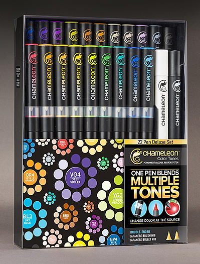
But the purpose of the colouring in was to trial and review the deluxe set of Chameleon Pens I recently purchased. There have been a fair number of reviews online, both good and bad, and a fair number of my Facebook friends had indicated they hadn’t got on with them at all and had returned them. I watched all the available videos I could find, as well as the shows on Create & Craft, found a good offer and went for the full set.

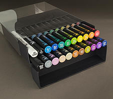
For the uninitiated, the pens are a basic dual tip alcohol ink pen – there is a bullet point and a brush-like nib. In addition is a reservoir of the solvent attached to each pen with its own  brush nib. In use, you put coloured tip to solvent tip, keep solvent on top and the pen upright for a defined period, and then start colouring – the solvent dilutes the colour, resulting in a tint which develops the fuller colour as the ink flows back into the nib. Thus from one pen, you can get all the shades. The ink on the page is also translucent, and along with other alcohol ink pens, blends whilst wet and overlays once dried. The deluxe pen set includes all 20 colours, a blending pen and a detail black pen, along with some spare nibs and an instruction sheet. They are in a handy holder which also presents the pens for use when open.

For my full review, read on… but in the meantime here’s the executive summary. I think in terms of colour intensity, blending, bleed and application, these pens are pretty much like-for-like alongside Letraset’s ProMarkers. Their USP is the many shades, one pen however:
PROS> no swapping pens constantly, no need for several pens or layers to shade light to dark, mix time allows for planning next area (i.e. time isn’t wasted). CONS>Getting large areas the same shade is very difficult unless keeping to undiluted pen colour; may need to use a different colouring method.

CONCLUSION: These are a great addition to my alcohol pens, and best suited to detailed images needing obvious shading. I’d not recommend them for large areas of same shade colouring – I’d stick with several ProMarkers. I certainly don’t regret buying them and definitely won’t be sending them back!

CCTPurpleDalia

Continue reading