Which watercolour effect?

I’ve been playing with various watercolour effects, out of curiosity more than any thing! Thought I’d share the results, just in case someone else might be interested… All of them feature a Stampendous stamp (Cling Poppy Scene #CRM234).

Continue reading

Distress palette distress!

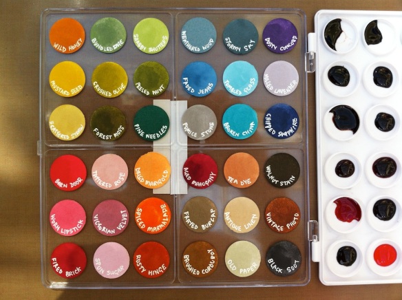
Well, I thought I had it covered… I took my distress ink palette with me on holiday, intending to do some distress water colouring while I was away. I popped it in a bag with a piece of kitchen towel, sealed it up, placed in flat in a box, flat in the car boot and off we went. It seems that somewhere along the 4 hour drive to Holyhead, the ferry crossing to Ireland and 1.5 hours driving in Ireland there was sufficient rock and roll to slosh things about a bit:

Needless to say, I didn’t get any water colour done with this palette – I had to use my distress markers instead. I decided not to waste the lovely colours and used an adaptation of my paper towel printing technique to produce lots of lovely coloured napkins for backgrounds and decoupage:

I have several plies of the oranges, the blues and the greens ready for my collages and bits and bobs. After I’d rescued and used what I could, I set to washing up the mess and replacing the colour swatches on the lid. As you’d expect, all the inks rinsed off the plastic leaving no residues, unlike the stickers which left their adhesive behind – no matter, it just helps the next ones stick more! A couple of hours later, and my palette is restored:

A happy accident? Time will tell as I use up the various bits of kitchen paper I used to blot up the  mess in my artwork – watch this space! I would also like to find a thin sheet of silicone/rubber to seal the palette for the next trip – or thin one inch rubber washers to stick onto the lid. The palette is great, both in construction and price – but it sooo isn’t water tight! I’ve also learnt to only use half a dropper full of ink in each well rather than the full one I did first time round!


Graphics & Illustration – Exhibition Piece

This is the last post based on my end-of-first-year exhibition pieces. Today’s is the graphics and illustration project – we had four sessions to create a collage based on the portrait and work of our chosen artist. I developed several collages, based on thumbnail images of the myriad works of Jacek Yerka, courtesy of a Google search. The two I chose to take forward were a simple cut and paste montage of as many thumbnails that would fit on an A4 sheet, and a number of thumbnails mounted on acetate hoops circling an image of the artist photocopied from one of his books (to represent his images being inspired by his dreams). I then researched and mocked up a magazine cover and article (based on Artists and Illustrators March 2012 magazine) and a book cover dust jacket using a photo of the 3D whirling dreams montage and a scan of the A4 montage.


Still Life – Exhibition Piece

This is another of my end-of-first-year exhibition pieces, this time for the four week still life module. It is white oil pastel and graphite on black paper, and took around four hours to complete. The items were all drawn separately and then grouped together for the piece with a single light source chosen. It was an exercise in creating ellipses which I now know are circles drawn in perspective!

Ceramics – Exhibition Piece

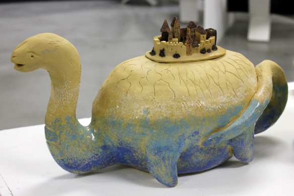
As regular readers will know by now, the last term’s work at college has been based on an artist of our choosing – mine is the Polish fantasy/surrealist Jacek Yerka. For our ceramics module this term we had to design and make a functional teapot based on our artist’s work.

This first image shows my three designs that reached maquette stage: I dubbed them ‘Time Flies’, ‘Town in a Teacup’ and ‘Brontosaurus Civitas’ – click on the links to see the original images on which they are based.

As you can see, it was worth doing the test run, as the Brontosaurus exploded on firing as I’d not left a big enough hole leading to the pot void… All would make functional tea pots, with the ring pot being the most striking, but trickiest to make. I decided to go for the quickest to make, and my original idea, as time was limited to get the pot finished, fired and glazed before exhibition night. Here’s the final pot – a little on the large size to be practical, but fully functional. The town is a close fitting lid, and decorated with various oxides. The main pot is internally glazed and decorated with slips and part glazed to give the impression of the monster being in water with cliffs leading up to the town. I think I prefer working small, as I’m far happier with the town than the pot!

Life Drawing – Exhibition Pieces

As promised in a previous post, here are two more pieces that I exhibited at my end of year show last week. These are life drawings of the same model – the first is my first attempt at using oil paints with a palette knife and was completed in around an hour (we had to work really quickly!). I was trying to emulate the style of David Bomberg.


The second was a two week pose, with around 2.5 hours drawing time – the first week I drew the outline and shaded with the colour soft pastels before sealing it with spray fixative. The second week I worked on developing the shading with charcoal and spray fixative only, rubbing back with sandpaper and layering and layering to get the darkest tones. I’d chosen Jim Dine as my influencing artist for this term’s work, and tried to emulate his way of working in this piece.

Many thanks to our model for her patience, and for her permission to share my drawings of her.

Mixed Media – Exhibition Piece

It’s been a while again since I’ve posted – I’ve been busy finishing off end of year projects at college, culminating in our exhibition last night. Here’s just one of my pieces (I’ll share some more in a couple of days), for the final mixed media module, inspired by the work of Jacek Yerka, my ‘chosen’ artist for this term.

Continue reading

Drypoint print – the gallery editions

As I mentioned in my original post, I planned to further work on my drypoint prints, adding tone and colour. Here is a gallery of the results – and the bottom right is the print I have given away, number 13 of 15 – and may be the winner will want colour added? Most of these are now mounted for the end of term exhibition. There are some other prints available to purchase if you’d be interested…

I think some work better than others – I’m not happy with the tea dye one, it’s too dark. I am happy with the greyscale/monotone trees with the colour window. The pastel is very much in keeping with Jacek Yerka’s work on which this is loosely based as he prepares his paintings with a pastel version first. Let me know what you think 🙂

Dabber Resist Mixed Media Canvas

One of the techniques taught in the Creative Chemistry 101 class with ‘Professor’ Holtz was a dabber resist – taking advantage of the fact that acrylic paint is waterproof when dry. Here’s a canvas I put together over the bank holiday weekend making use of the technique, and how I did it follow after.

Continue reading