I’m teaching my card project today in Leicester – and I think this may be another innovation… For the squares on this card, I’ve cut up a juice carton (the foiled type Tetrabrik) into 3.5cm squares before embossing using a Big Shot and Fiskars texture plates and then colouring with alcohol inks and mounting onto black cardstock. I took off the ink with a cut’n’dry nib soaked in blending solution, and outlined the areas with a black permanent fine tip marker. The ‘leading’ is Pewter Liquid Pearls from Ranger. Recycling at its best!
Tag Archives: original design
Paper Towel Printing – Distress Inks
I’ve carried on playing with my newly discovered technique, and thought I ought to try Paper Towel Printing with distress inks. Here’s a step by step guide:
 Firstly, place your sheet of paper towel onto a glass mat or other non-absorbent surface. Wet by spritzing with water.
-=-
 Then I spritzed with homemade glimmer mist spray – good to have a background colour. I think it also helps the other colours keep in their place… This one is Peeled Paint with gold perfect pearls.
[To make your own mist – take one dropper full of reinker and add it to a mini-mister. Add a small scoop of perfect pearls. Fill with water to three quarters full, replace cap and shake vigorously. Spritz.]
-=-
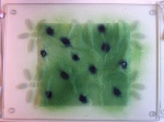 Drop on ink from your choice of distress ink reinker – this is Faded Jeans.
-=-
 Spritz each of those dots with water until they start bleeding.
-=-
 Repeat with more colours – this is Spiced Marmalade.I also added Dusty Concord.
Spritz with water.
-=-
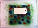 Start printing! Lay a tag/paper/cardstock/ATC on the towel and smooth down with your fingers. You may see water squeeze out of the edges at first – that’s what you’re after 🙂 You’ll also find the colours start to spread a little more into one another.
-=-
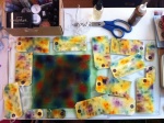 All of this from one sheet? Yup – and they are all double-sided as well. It seems that the colours stay pretty much where you put them, so this would be great to carry a colour theme throughout a tag book, or art journal, or across several pieces of cardstock for scrapbooking or card making.
-=-
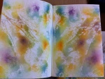 And there was still some left over to do my art journal 🙂
-=-
 Close up of the tags – they’re a bit blotchy still as I didn’t wait to dry them before sharing this blog entry with you! Lots of texture on some, lovely watercolour effects. Love it!
Paper Daisies
Apparently hospitals don’t allow flowers to be brought in any more. Presumably greenfly are in danger of spreading MRSA around as they don’t sanitise between flowers? Any how – this lead to a request to make some paper flowers to take instead. And here they are. Using the large daisy punch, I sandwiched a whorl of florists wire between two cardstock daisies, stuck down with Glossy Accents. The centres were then layered with yellow six-petal flower punch, then a brown cardstock one inch sun punch before topping off with a disc of Liquid Pearls. Some petals were scored with small embossing tool, others were curved by pressing around a narrow cylinder. Rather pleased with the outcome, and so was my friend 🙂
Paper Towel Printing – for art journals and backgrounds
I’ve been playing today 🙂 And one of the things I got playing with was a paper towel. I originally planned to dye it with acrylic paints/inks for decoupaging into my art journal. But one thing led to another, and before long, I’d ended up with what I think to be a totally novel technique – at least I haven’t seen it in all my hours browsing art journal techniques online. I’ll be calling it Paper Towel Printing, and this is the result:
Hit for Six
This week’s challenge at Passion for ProMarkers is ‘sporting marvels’ [Week #102]. I couldn’t find an image I liked, and being of a non-sporty inclination I don’t have any stamps either. So I created my own digistamp, tracing a picture out of Saturday’s Times newspaper, scanning it, tidying it up in an image editor and then printing it out onto coated cardstock before colouring in. The figure six and the ball were hand drawn. A couple of bits of ephemera (gleaned from the net, printed in colour and then distress inked), layering with foam pads, and the card is complete.
Incidentally I was one of the winners in their grand second anniversary draw last week 🙂
Red, White and Blue Shoe
This week at Passion for Promarkers, their 100th challenge is ‘red, white and blue plus a charm’. It’s taken a few days of mulling over, and an hour in the construction, but here is my card. I didn’t want to go down the flag route and remembered bowling shoes the last time I was at the ten-pin skittles alley – you know the ones… laces that are too long, and they feel like clown shoes. They fit the challenge perfectly. The charm laced onto the shoe is ‘live’ – bound to encourage a bowling aficionado.
Cool Dude
Passion for Promarkers Challenge Week 99 theme: ‘for a teenager’. This DL sized card is my original design. The black base of the skateboard is wet’n’dry very fine sandpaper adhered to the card with Glossy Accents (a glue stick just didn’t do the job). The wheels and graffiti were drawn freehand, coloured with ProMarkers and given white highlights with white gel pen. The wheels are mounted on foam pads for a bit of depth.
Freestyle Peyote Bracelet
I started this bracelet in a workshop on freestyle peyote and some six hours later decided it was finished. The organic nature of the design allows for more and more to be added, so an end point has to be called at some point! I’m pleased with my first effort, but think I will use less contrasting tones for my next one, and perhaps not start with such small seed beads (they made for a very slow start!). I’m also going to need a sample wrist size for my starting length as mine are a little on the large size for a woman’s bracelet… Feedback and offers to purchase appreciated 😉
Glass Painting on Mirror
This is my first attempt at applying lead strip to glass and then painting to give the stained glass effect. The design was freestyle trial and error. The mirror is 20x20cm (8x8in) square. Of course, photographing a mirror without appearing in it turns out to be quite tricky – I think I will have another go in better light. In the meantime, I’m sure you get the idea! I’d love to have some feedback on this – what do you think? And if you’d be so kind as to complete the poll too (no obligation to purchase btw)? Continue reading
ProMarker Storage
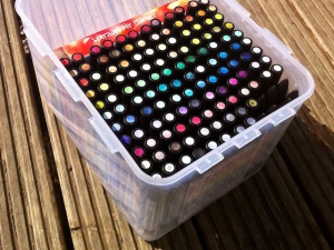
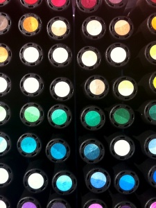
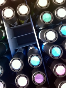
I’ve seen several ways of storing ProMarkers, but few of them seem to be easily portable. With my need to move my ProMarkers from workshop to workshop as well as from craft room to in front of the TV and back again, I decided to make my ProMarker storage portable.


