ProMarker Challenge: Retirement card

Over at ‘Passion for ProMarkers’ this week, the challenge is to create something ‘for grandparents or older people’. I don’t have any witty sayings or almost-insulting pictures to colour in, so I went for the traditional retirement card for gardeners. So here’s my challenge entry, coloured with ProMarkers:

I’ve left it as a topper for now, until such time as I find someone to send it to! I’ve used my aged stash of Art Impression stamps for the images. I stamped either with ProMarkers for direct colour (be quick else the ink dries) or inking with Memento Tuxedo Black and colouring in if there were outlines required. Extra lines (fence and watering can handle) and the text are drawn with permanent pigment pens (either Sakura or Unipin). Much of the colouring is tone-on-tone with the same colour ink layered to give texture and shading.

Sparkling Tatty Teddy

I last entered a ProMarker challenge in July 2013 and thought it was high time I had another go. This afternoon I coloured in a wooden stamp that predates even my last challenge attempt – it’s from 2011. This week’s challenge at Passion for ProMarkers is ‘sparkle and shine’. I’ve used ProMarkers to colour the image and added sparkle with Stickles and a wee bit of shine on the nose with Glossy Accents.

Continue reading

More experiments in colour: mandalas and Promarkers

I’ve drawn a few more mandalas and, during breaks from doing my accounts, I have done some colouring in. This time I seem to have played with tints and shades of the same colour with some grey and an accent colour thrown in here and there.

Stained glass window? Feels like the middle is draining away…
Simple and blue. I’m not sure of this one, I think the light pink is too dusky.

I’ve used Promarkers to colour these mandalas – alcohol-based ink pens allow blending and layering and smooth gradients.

Arts in Worship

I’ve recently joined a new worship group at the church I’ve been going to since December 2012, Whetstone Baptist Church. As there are two of us trained to work the data projector, I was at a loose end a couple of Sundays ago, and thought I’d do some art work during the service. I’d had a couple of sheets of pre-coloured watercolour paper left over from a craft club, so took one of those, a permanent black marker, a white Signo pen and drew this during the services:

Beautiful One

Inspired by words of one of the songs, and adding other lyrics and phrases from the sermon made this a specific act of visual worship for that service.

Encouraged by the response to this, I was then asked to do some more artwork to complement a service last Sunday where the plans for a new church building were to be revealed. The artwork was to illustrate ‘Waiting here for you’ to be sung as a duet, leading into a time of reflection and prayer. Using much the same technique, I blocked out areas using black acrylic ink after colouring the page using inks, ProMarkers, paints and stains. This time though, it was two days work prior to the service! These were the featured pieces:

The beauty of this approach, over stock imagery, is that the artwork can directly fit the emphasis of the service – in this case, I used the ‘wait’ text to illustrate several meanings of the word that emphasised anticipation and service rather than the more common sitting-around-twiddling-thumbs kind of wait.

I enjoyed the creative process, looking at all the different ways I could decorate the pages before blocking out the negative space. Some needed tweaking in Photoshop (for instance the addition of the lens flare in a couple), but most were unedited aside from adjusting brightness and contrast for data projection. I will definitely be doing more of this type of worship in the future, and may be even gearing up for ‘live’ artwork creation as part of the service.

Playing with ProMarkers

It’s been quite a while since I had chance to enter any web challenges, and since planning workshops is going fairly well, I decided to use time today to put that right. I’ve got out my ProMarkers again, and created two cards:

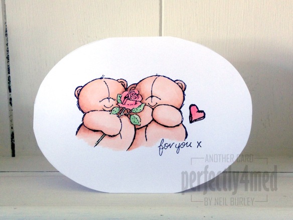
For you...The first is for the ‘Less is More’ one layer challenge this week, which requires that I use a ‘not square or rectangular’ card. I used string theory to draw out an ellipse template and transferred this to a card made from my favourite white coated cardstock (from Rymans) before stamping the image [docrafts] using Memento Tuxedo Black. I coloured the bears with Blush, Saffron, Ginger and Cinnamon, with Meadow Green/Apple and Pastel Pink/Salmon Pink for the roses.

Picnic timeThe second is for the ‘Passion for ProMarkers’ weekly challenge, which this time set the task of ‘set the scene’. I stamped the background image [Hobby Art – Countryside Scene] in Archival Jet Black onto watercolour paper before using AquaMarkers in Frost Blue/Perwinkle, Celery/Spring Green/Fern Green and Viridian with Granite and a waterbrush pen to colour. The picnic blanket was drawn freehand and coloured with ProMarkers – Warm Greys 1-4 over Lipstick Red. The girl is a stamp from Bild Malarna ‘Mimosa – Wonderful Day’ and complements the scene beautifully – she is stamped with Memento Tuxedo Black and coloured with ProMarkers: Pastel Yellow/ Sunflower/Gold and Caramel and Lavender/Orchid/Amethyst and skin tones blending Blush/Oatmeal and Apricot.

Blue Hues in a Can

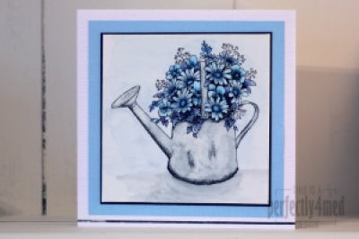
It’s a ‘Favourite Colour’ theme over at The Crafting Cafe, and I decided my favourite colour this month is blue, and used the fabulous Floral Watering Can from their sponsor Delicious Doodles for my base image. I recently fell in love with Letraset AquaMarkers, bought the entire set, and played with them some more for this card.

I started by printing two copies of the image onto 90gsm watercolour paper using my laser B&W printer. I added AquaMarkers to the crosshatched areas of the design (as these will be the darkest) and dragged the colour across the rest of the space with a waterbrush pen. I added extra layers of colour where needed by allowing the first layers to dry before painting on colour picked up from a palette (draw on a plastic sheet with the AquaMarker). That’s how I built up the mottled watercolour effect on the can and the shadow.

For added depth (not easily seen on the pic) I coloured in the second copy and cut out selected items, edged them in black and layered them decoupage stye onto the flowers. Try to choose things that aren’t overlapped by anything else and you’ll get the foreground elements perfectly.

Pens used:
Can – Pebble Grey
Flowers – Deep Sapphire/Storm Blue/Vintage Blue/Mediterranean
Background – Pebble Grey/Frost Blue

Mounted on black card over Bazzil on 14x14cm ‘linen’ style card. The metallic strip at the bottom is by Letraset and helps ground the image.

Let me know if you’d like a more in-depth/video tutorial on using AquaMarkers. I think they’re fab!


Tulip Cards

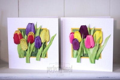
I’m on another design team! Early in January I was selected to design for ‘The Crafting Cafe’, and they have just launched their challenge blog. For the ‘anything goes’ theme this month, I’ve used the fabulous ‘Tulips 1’ digi stamp from LEJ Designs. I’ve created two cards, the first using ProMarkers to colour, and the second with Distress Reinkers both on a bespoke background created with Distress Stain and kitchen salt:

Continue reading

Letraset Neon Markers – review

I’ve just received a complimentary set of the new Letraset Neon Markers (6 set), on sale from 1st September 2012. According to the information sent with them, they are twin tip fluorescent markers offering water-based pigment ink which is lightfast and ‘perfect for adding vibrant highlights to art and design work’.

I decided to put them through their paces. Firstly – colour on white, and then because they are pigment inks, on black too, and across text:


Allowing for poor colour reproduction of fluorescents, the colours are what you’d expect to see on white – vibrant and in your face. The ‘spark red’ isn’t all that sparky, but I guess it joined in to make the six pack… On the black, there’s going to be a colour shift, and I put three layers of ink on each of the blocks to get enough pigment on to show up – all but the ‘Luminous Yellow’ have good coverage, and may well have a role to play on dark backgrounds. They clearly work well as regular highlighter pens.

Do they blend? I love to use Letraset ProMarkers as they blend so well together. The AquaMarkers also blend and merge nicely. So I put the new Neon markers to the test, and since they are water-based, I used them on a good quality watercolour paper:


Well, I’m not so impressed. Direct blending from the pen didn’t really happen – it rucked up the paper, and the colours tended to keep distinct from one another. Adding water caused the crossover to become blotchy and granulated. Washing out with a wet brush was slightly better, but the colours behaved differently, some moving readily, others less so.

I can’t see these markers making their way into my artwork – I don’t think they have the flexibility of use I enjoy from the ProMarkers or AquaMarkers, and I already have highlighter pens around the house that do the same job. I think Letraset have missed a trick here – the Neon Markers don’t seem to be either ProMarkers or AquaMarkers and that’s a pity.


Twelve Tags of 2012 – September

I’ve been playing with various options of putting colour onto metal – here are the results! I’ll be showing how to do them at the Manic Stamper Craft Club on Saturday.

The tags are first covered with metal foil tape (really thin foil – serves me right for going to the local poundstore!) and then I used a small embossing ball tool to emboss the outlines. Rub over the whole tag with black acrylic paint, and then wait for it to almost dry before rubbing off the paint from the tag – it should catch in the outlines. Add colour with acrylic inks (I used a paintbrush), Promarkers or alcohol inks (I used the Adirondack alcohol ink pen filled with blending solution to pick up dried alcohol inks from a palette). I love the aged look to the metal caused by the black acrylic, and the translucent colour from the Promarkers/alcohol inks. The acrylic inks are more luminous due to their opacity. By the way, alcohol seems to denature acrylic, so if your black coating doesn’t work out, wipe over with alcohol hand gel and try again!

And as a bonus, I’m publishing the forget-me-not doodle as a tangle pattern 🙂