AAA Cards challenge: January’s sketch

Well, here’s a thing. I’m no longer on the AAA Cards design team but I thought I’d join in their challenges now and then when I wanted something creative to do that wasn’t ‘work’. January’s sketch design is the first for the year – a prompt for your card layout. Here’s my entry:

AAA Cards Challenge: January's sketch
Continue reading

Bible Journaling; Jeremiah (BJ-25)

It’s time for another Bible Journaling session at The Studio. In a change to the published programme, there is no session tonight – it has been moved to next week (16th Oct) so that more can attend. There are still spaces available: just let me know if you’d like to come. We’ll be working on verses from Jeremiah. As always, the session is suitable for complete beginners to accomplished artists, with templates available for those that aren’t brave enough to do their own thing from the start. I’m setting a ‘one colour challenge’ and there’s the opportunity to add some sparkle to your pages. Here are the examples for the evening:

Continue reading

AAA Cards DT: Sketch ± baby card

Time for another clean and simple card challenge at AAA Cards. This week we have a sketch to work to (see below). This is a guide to a card layout rather than drawing your own. The optional extra is to make the theme suitable for a baby. Here’s my card as part of the design team’s inspirations:

Baby themed clean and simple card

Continue reading

AAA Cards DT: Anything goes / spring animals (#211)

Though the theme is ‘anything goes’ it’s important to remember that over at AAA Cards the challenge is to keep it clean and simple. I’ve incorporated the optional theme of ‘spring animals’ into my CAS card. It’s one of the more easy challenges to take part in – why not have a go?

anything goes with spring bunnies

Continue reading

AAA Cards DT: Sketch and silhouette (#210)

This week’s clean and simple card challenge at AAA Cards is to use the sketch provided to inspire your own makes. There’s the added theme of ‘silhouette’ to throw into the mix. Here’s my design team card…

sketch and silhouette of flowers in a vase

Continue reading

AAA Cards DT: One ninth with favourite animal (#209)

In this week’s challenge over at AAA Cards, we’re set the task of using just one ninth of the card for our elements. Which ninth you use is up to you, as is the size of the card. I chose a dog as my favourite animal and worked back from there to get the right size card to fit into my ninth. Ok, it overlapped a little, but the essence is certainly there!

Continue reading

Creative Jumpstart 2021: The first week

I signed up to do Creative Jumpstart 2021 back in November. What with Covid and no studio groups to prep for, my creativity has had a minor slump and I’ve not even had the mojo to create for the fun of it. Creative Jumpstart has a daily 10-15 minute tutorial or inspiration video to watch and so far it has included monoprinting, art journaling, illustration, watercolour and collage as part of the ‘storyteller’ theme. I’ve had a go at all but one so far and it’s been great to challenge my prejudices against some media (watercolour!) and to try out new media. Here are my attempts at the first week of projects:

Continue reading

LIM DT Card: Scribbles, Drips and Splats

I’m delighted to be able to share that I have been accepted on to the Less Is More Challenge Design Team. You’ll all know that I have recently been taking part in their challenges after a long hiatus, and it’s an honour to join the DT. You can find the fortnightly challenges here, and a little more info on the card(s) I make following the theme here on my blog. You may even get to see the outtakes…

I’ve used one of my most favourite techniques for my card for the splats – get your Distress Stains out, make sure the tip is nice and juicy and then firmly tap against your page (actually, you thump it down with a bit of force). Watch where the spatter goes!

Continue reading

Challenge: Colour Palette

Over at Less is More this week, the challenge is a colour one: to use red, raspberry and grey. The colours are complementary but clearly restricted! I unearthed an old Creative Expressions stamp of a daisy, which I thought could double up as an echinacea cone-flower which suits the colour scheme. I chose Warm Grey 3 ProMarker, along with Hot Pink and Carmine to match the screen colours set by LIM. I used the red to shade the inner part of the petals which doesn’t show up overly well in the pic…

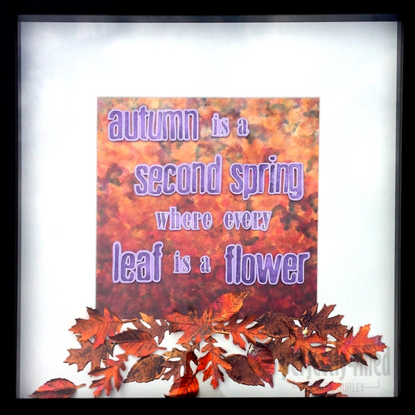
Autumn arrives…

Autumn arrives

It’s officially autumn here in the UK, and on cue, the sun has disappeared, the temperature has plummeted and the rain is thrashing down! I’m having a go at getting on the Creative Expressions Design Team, and submitting a last minute entry to their design team call which closes today. As part of the application, I had to create a piece on the theme of ‘autumn’ and spent Wednesday making this piece. It’s in a 50cm square frame and features a 12×12″ alcohol inked glossy background, stamped and heat coloured embossed copper leaves and stamped and outlined lettering. For more making details, read on!

Continue reading