Art Journal Page: One Word [Wanderlust]

IMG_6800

In the first Wanderlust class of the year, we were prompted to use just one word on our pages – and yesterday, I was so tired. Poor sleep, recovering from a cold and a wet grey day all got poured into this art journal spread. Building on the learning gleaned from the first pick a stick challenge, I layered and layered, and am actually rather pleased with the result, as grey and drab as it is!

It’s the first time I’m working in a spiral bound art journal – this one is a Daler-Rowney Cachet Artist’s Mixed Media, A5 sized, 30 page, 250g/m2. The paper is wonderful to work on, didn’t buckle under the wet media or bend with dry acrylic and basically took everything I threw at it. There’s just one issue – the spiral bound spine: those pesky wires. I’m sticking with the book for the Wanderlust classes, but will be looking for stitch bound journals in the future.

Continue reading

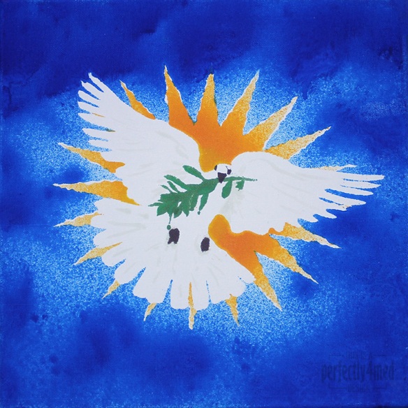
Seasonal Colour Palette – Dove of Peace

I like a challenge… and I like it even more when I get inspiration, have the materials, and more importantly can snatch a moment to get the piece done. So it is with some delight that I share with you my entry to the Ranger Ink ‘Seasonal Color Palette’ Challenge: to create any project using the theme colours based around the Adirondack Color Washes in Butterscotch, Meadow, Espresso and Sailboat Blue. It’s a 12×12 inch canvas:

Color Wash Dove

From concept to final outcome took approximately 3 hours, with only two hours of hands-on crafting. I started by using Adobe Illustrator to produce an outline of the starburst, dove and olive branch, printing it out four times. Each copy was then sprayed with fixative spray to seal it, which stopped the colour wash bleeding through. I cut out the various items to produce stencils – the central outline, the eyes and beak, the branch, and then the starburst ‘prongs’. I used repositionable spray glue to coat the back and adhere the stencil firmly to the canvas before spraying each of the colours on in turn, using a heat tool to dry and heat set between colours. Aside from a bit of overspray and bleed, and a little stencil misalignment, I’m quite pleased with the result. I did a little touching up here and there with some of the Distress Paints, which may be hard to see as they picked up some of the dye layers beneath.