 This next card on the seaside/nautical theme is again designed by Sam Poole and part of the Creative Expressions Singles range. ‘Lighthouse’ includes both the image and sentiment. I wanted to highlight the light element of the sentiment and image, so used a dark background to highlight the iridescent pigments and white opaque pens. This created a colouring challenge, as you need to take account of the dark background and the layering of dye based colour in the distress markers. I’m actually quite pleased how well it matched my internal image!
Tag Archives: distress markers
Father’s Day Card – Just for You (and for Creative Expressions)
It’s a seaside and nautical theme this month for the Creative Expressions Design Team with various stamp designs making their debut. This week, I’ve used two designed by Sam Poole, the Creative Expressions Singles ‘Nautical Words’ and ‘Netting’. A quick and simple card, perfect for a last minute Father’s Day card. Or for any special nautical person for that matter!
Two watercolour effect cards (for Creative Expressions)
 This month’s Creative Expressions Design Team projects include two new Singles stamps: Get Well Soon and Thank you. I’ve embossed the outlines onto watercolour paper, adding to the attractive distressed look and coloured using Distress Markers and a water brush. The clean and simple look is finished off with matting onto card and a few dots of coloured PVA from Cosmic Shimmer.
Altered Art Triptych
Drypoint print – the gallery editions
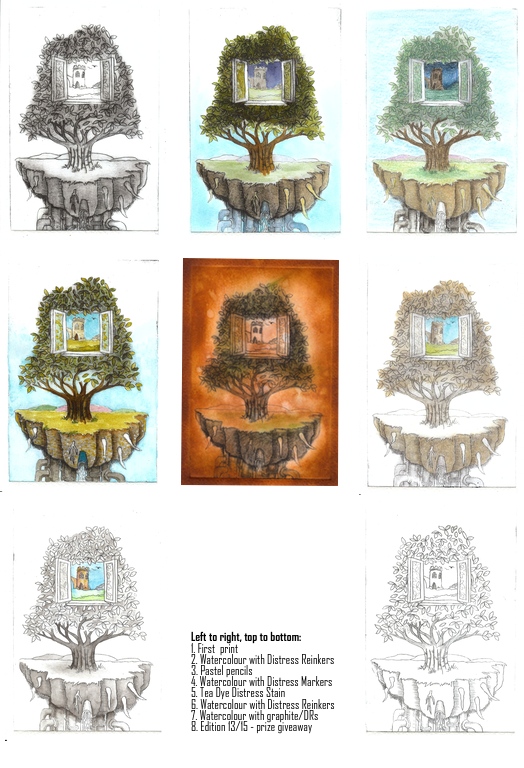
As I mentioned in my original post, I planned to further work on my drypoint prints, adding tone and colour. Here is a gallery of the results – and the bottom right is the print I have given away, number 13 of 15 – and may be the winner will want colour added? Most of these are now mounted for the end of term exhibition. There are some other prints available to purchase if you’d be interested…
I think some work better than others – I’m not happy with the tea dye one, it’s too dark. I am happy with the greyscale/monotone trees with the colour window. The pastel is very much in keeping with Jacek Yerka’s work on which this is loosely based as he prepares his paintings with a pastel version first. Let me know what you think 🙂


