I thought I’d catch up with a couple of days’ worth of classes today, but, alas, it wasn’t to be. I did however get Day 2 samples done – a few more well used techniques revisited, but a couple of new ones there too. And a note to self, in passing… Always test your mica containing sprays well away from other items in the studio, and clean them before putting them back in the box. That way, there is a fair chance the spray a) mists rather than spurts, and b) actually sprays.
Tag Archives: distress marker
Summer of Creative Chemistry: Week 2
I’ve snatched some ‘me’ time in the studio today and revisited some of the lessons on distress stains and markers from Creative Chemistry 101 – a staggering four years ago! It’s part of the Summer of Creative Chemistry from onlinecardclasses.com, in the lead up to the brand new Creative Chemistry 103 from Tim Holtz. These are three tags created for Week 2.
Never Been Used: more in my art journal…
I’m still trying to get a new trend going – tagging a post where I’ve used something that hasn’t previously been used by me as #nbu – never been used. One problem is finding time to do it myself! It’s part of my determination that nothing comes into my studio that I don’t then use in some way…. perhaps a rather weak way of justifying the purchase in the first place! Anyway, I finally did something last night with my Tim Holtz/Stampers Anonymous stamp set ‘Remnants’ (CMS130):
Lighthouse Card for Father’s Day (and for Creative Expressions)
 This next card on the seaside/nautical theme is again designed by Sam Poole and part of the Creative Expressions Singles range. ‘Lighthouse’ includes both the image and sentiment. I wanted to highlight the light element of the sentiment and image, so used a dark background to highlight the iridescent pigments and white opaque pens. This created a colouring challenge, as you need to take account of the dark background and the layering of dye based colour in the distress markers. I’m actually quite pleased how well it matched my internal image!
Father’s Day Card – Just for You (and for Creative Expressions)
It’s a seaside and nautical theme this month for the Creative Expressions Design Team with various stamp designs making their debut. This week, I’ve used two designed by Sam Poole, the Creative Expressions Singles ‘Nautical Words’ and ‘Netting’. A quick and simple card, perfect for a last minute Father’s Day card. Or for any special nautical person for that matter!
Stamping Sprigs on Spring Cards (for Creative Expressions)
Also in my goodie package this month from Creative Expressions were two new Singles stamps, Ivy Corner and Botanical Spray. Each features a leafy sprig, along with a cute insect. I decided to get my Distress Markers, Vintage Mist and pearl PVA out to use with them…
Quick mixed media tags
I’ve got into the studio at last to do my own thing in between some craft room reconfiguration and college work! I’ve chosen to do some quick mixed media tags using mainly Ranger/Tim Holtz products:
Which watercolour effect?
I’ve been playing with various watercolour effects, out of curiosity more than any thing! Thought I’d share the results, just in case someone else might be interested… All of them feature a Stampendous stamp (Cling Poppy Scene #CRM234).
Take three stamps…
Take three stamps, add a little bit of colour magic and hey presto, another challenge entry! Well two, I couldn’t make up my mind which I liked best… It’s one layer week at ‘Less is More’ and the stipulation was to use three stamps, not two, not four, three. There’s precise for you!
 Hero Arts Long Writing Background (F2674) in Frayed Burlap DI
Impression Obsession Textured Evening Gown (D4320) in Sepia Archival
Sentiment from WOW! Everyday Sentiments Clear Stamp Set in Jet Black Archival
-=-
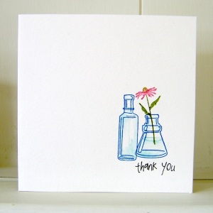
Inkadinkadoo Arrange A Bottle Cling Set
WOW! Everyday Sentiments Clear Stamp Set stamped in Jet Black Archival
Bottles: Manganese Blue Archival, shading with Tumbled Glass Distress Marker
Flower: Tea Dye, Walnut Stain, Peeled Paint and Worn Lipstick Distress Markers
Creative Chemistry 101 – Day 6

At first I thought I’d have to skip Day 6 – Distress Markers – as I haven’t yet received my order I put in using my birthday funds. But then I remembered I had three pens from a workshop with the Professor himself back in February! Here’s two of the technique tags:
 I used the coated card stock I usually use for ProMarkers in place of the speciality stamping paper, and though I can’t directly compare, from the description given during class, it seems to do the same thing. It’s the Ryman Bright White Coated Card 200gsm.


