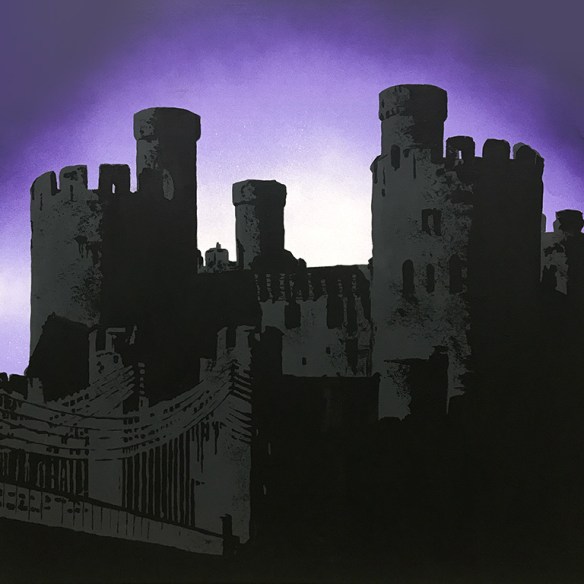
Commission: Castle Series, no. 1, Caernarfon

I’m having fun in the Studio, actually playing with paints and canvases for a change. It’s also been a little while since I have had any commissions. This is the first in a series of six canvases, each requested to feature a Welsh castle. The main colour of the room is grey, and the accent colour is purple.

I’ve loved the ‘purple twilight’ type photo treatment, and there’s nothing more striking (I think) than a castle’s silhouette. It gives a much more solid appearance, and given most castle’s prominence on the horizon, a real immenseness.

Caernarfon CastleMy first is that of Caernarfon Castle. It took me a couple of tries to get the tonal shades right – my first go didn’t have enough contrast between the grey and black.

Continue reading

Art Journals: using acrylic covers

I was on Hochanda this week demonstrating techniques for using the acrylic covers effectively, for the A4 and A6 journals from That’s Crafty!. As always, there is too little time on air to fit in all my ideas, and only just enough time to fit in all I had planned! What follows below are photos and quick explanations of how to do your own. I really need to remember to take step-by-step photos as I make so that I can do a proper tutorial post! First is an unbroadcast cover, then the mirrored cover that didn’t go so right when rushed, and last for this post is the bubbling water effect shown in my first hour.

  • Peel off the protective film from the reverse of the cover
  • Work on the reverse side for all the following steps
  • Place the snowdrop stencil in position and fill in using Posca pens
  • Dry, then place the TIME stencil upside down and sponge through ivory paint
  • Dry, spritz with gold mister, dry
  • Meanwhile, print texture stamps onto large Rizla papers using Chartreuse archival ink
  • Heat set the ink, then using decoupage glue/multi medium glue overlapping layers of the printed papers
  • Once dry, any paper over the edges of the cover can be sanded off

  • Peel off the protective film from the reverse of the cover
  • Working on the reverse, add alcohol inks until you are happy with the coloured layer
  • Place the JOURNAL stencil upside down and sponge a layer of Jet Black archival ink through onto the alcohol ink
  • Remove the stencil and then rub away the black in with a clean cloth/kitchen towel
  • Repeat inking steps if you want to remove any more of the alcohol ink
  • Now spritz with a water-based varnish (e.g. Pentart spray varnish) to seal the ink
  • IMPORTANT: allow to fully air dry, do not heat. Repeat varnish layer
  • Spritz with Pentart Mirror Mist and heat dry immediately to stop the mirror mist weakening the varnish beneath
  • Seal the mirror mist with the same varnish and finally apply a layer of black acrylic paint
  • Peel off front film to reveal your results

  • Peel off the protective film from the reverse of the cover
  • Working on the reverse, and using the word stencils the wrong way up, sponge your main colour onto the acrylic; heat dry and repeat directly over the top.
  • Next, sponge your shadow colour through the same stencil, slightly offsetting from the first colour
  • For the water effect, first dilute some white gesso/primer
  • Working quickly, cover the whole sheet with a layer of watery paint and then dab isopropyl alcohol into the wet paint – it will push the paint away and start the effect
  • When you are happy with the effect, heat dry in a well ventilated room
  • Repeat with a light shade of blue, and then another darker shade of blue
  • This technique will work over any sealed surface, but does rely on the paint being thinned and still wet
  • Try adding text to the front of the cover as well, this time starting with the shadow colour and working over the top with the main colour

Bonus post

Later this week I will do a separate post explaining my ‘now-you-see-me-now-you-don’t’ technique that was a wee bit rushed at the end of the second show:

Continue reading

Art Journal: American Adventures [Travel Journal]

It’s taken some time, but I’ve finished the journal I handmade last year and finally got round to taking and editing the photos of the finished article. I intended to journal each day before going to bed, but got a little behind whilst in New York as our room was so small that there was actually nowhere to work on a flat surface, and there was no communal area I could use either. Consequently, by the time I got to Boston, and there was space to work, I was already five days behind. Then life on the road for the final few days also meant I was doing other things at the end of each day. So it meant finishing off the work once I got home, but that brought back good memories of a lovely, and much needed, holiday.

As a format, the piano hinge worked very well – I was able to slide out each of the sticks in turn to work on the pages individually, which was far easier. The fold out sections added a little more space, and the wallets somewhere to put the various bits of ephemera that I collected along the way. With techniques from collage to napkin decoupage, hand drawn typography to watercolour illustrations, it was fun to put together. I would have liked to do more urban drawing, but for speed, mini-photos had to suffice.

Sit back, with a cuppa of your choice, and holiday vicariously as you work through the journal 🙂

Continue reading

Memory Quilt: two more appliqué panels

I’ve completed two more panels for my appliqué memory quilt, recording our journeys in the USA over Christmas. These flank the first panel I made, completing the bottom row. I’ve started on the second row – the first row is the most tricky from a conceptual point of view, so I’m leaving that until last! I think my satin stitch has improved, and I’ve definitely got the hang of transferring my sketches to make fabric images.

Still to do: fabric interpretations of Trinity Church, Boston; The Chrysler Building, Rockefeller Center and World Trade One. All of those are going to take a bit of work to choose from the fabrics to get the best sense of depth with such a limited palette of colours. That said, I’m rather pleased with how the Mayflower turned out – the stripes on the side were part of the fabric, with careful positioning of the cutout of course…

Continue reading

Memory Quilt: Block No. 8

No, you haven’t missed seven previous instalments – this is the first of nine blocks that I’ve tackled for a new memory quilt.  I wanted to make a quilt as a ‘souvenir’ of our trip to the USA over Christmas – in addition to my travel journal which is yet to be finished…

We chose the fabric whilst away, in a lovely quilting shop, Stowe Fabric & Yarn, in Stowe, Vermont, and once I got home and had five minutes to myself, I started designing. It’s the first quilt I have made that uses appliqué techniques – and I’m going to need a bit more practice on my satin stitches I think. The quilt is going to feature nine appliqué panels, and here’s the first. No guesses as to which tourist venue this panel refers to…

Continue reading

Handmade faux leather book

I’ve previously made a ‘book’, to hold various ephemera, as a leaving present for the minister of my previous church. So when it came to putting together another bespoke binder for prayer flags, a photo book and collected digital photos, I built on my previous project and created a faux leather effect ‘book’.

The ‘book’ is just about the size of a sheet of A4 and about 1½” deep. Constructed from 2mm greyboard and 5mm foamcore board, the canvas cover is painted with a mix of rose madder and burnt sienna acrylic paints to resemble worn leather. The spine text is pressed in with an embossing tool to give an impression of embossed foiling, whilst the frontplate uses careful shading to achieve the same effect.
Continue reading

Altered Art: Decorated Tree Decoration

treeThis is another of my specially designed tree decorations for today’s workshop in The Studio (candy cane one here if you missed it). The workshop has just finished, so you’ve missed out! Cut out from card and pushed onto a split-pin clothes peg, I’ve decorated with DecoArt Media fluid acrylics, Ranger Stickles and Liquid Pearls.

Continue reading

Art Journal: Piano Hinge Travel Journal

For my next trip abroad, I wanted to make another travel journal. I have previously handmade a small hardback pocket journal and a fold-out accordion journal. This time I decided to make a handmade journal using a piano hinge. This, for the unfamiliar, uses tabs and cylindrical objects (in this case bamboo skewers) to attach the pages at the spine. The benefit for a travel journal is that every other spread is the depth of the bamboo skewer, which means there is plenty of room for additional items of collage and other ephemera, and pockets to store memorabilia. It’s also possible to easily disassemble the book at the hinge to work on individual pages, or remove and add pages as required.

Constructed from canvas textured acrylic paper, I knocked back the white using an off-white chalky finish acrylic paint. I added a darker shade at the base of each page, using the same paint to stencil the building outlines. Overprinting with various travel oriented stamps using archival ink completed the decoration. It seems that the convention for piano hinge books is that the spine is visible, and the skewers extend from the bottom and the top. I wanted a more traditional book appearance as well as a protective cover, so I constructed cover pages before covering them with lokta paper which resembles old leather. A few coats of soft-touch varnish added to that illusion as well as protecting the paper. Adding this type of cover does restrict the addition of further pages. As I intend to use this on the flight as well, I thought it wise to trim the skewers… Some care needs to be taken to keep the pages vertically aligned, but in practice friction seems to keep the posts in place.

Continue reading

Altered Art: Candy Cane Tree Decoration

candycane

I’ve designed some hanging decorations for December’s workshop that slide onto a wooden split type peg. There are several designs, but this is one of the newer ones, and certainly the most complex to colour in… Using nothing more than five colours of ProMarker and a pencil, this candy cane tree decoration is ready to copy! There are spaces available, but please book in as soon as possible – I have a lot of cutting out to do…

I’ve also been playing with my Foldio360 bluetooth controlled turntable a little more. It’s recently had some new DSLR settings provided meaning that, finally, it remotely controls my proper camera for top notch pics, which I can then edit and stitch in Photoshop. Now to find a decent 360° viewer plug-in for WordPress so that I don’t have to save as a clunky animated GIF.

candycane

Continue reading

Commission: Baku 2016

img_7362For the last two days, I’ve been working with my mum to complete her commission for a piece of artwork featuring the skyline of Baku, Azerbaijan. Mum knew what buildings she would like to include, and provided the primed canvas (roughly 90cm wide) and a sketch of the layout. The first step was to tweak the sketch a little to improve the flow around the picture.

That done, we settled on trying a bas relief technique since she had no preconceptions of a finished piece. Thus started a mammoth 5 hour session cutting, pasting and carving paper clay, finishing at 10:30pm at night in an effort to allow drying time overnight. Unfortunately, humidity prevented that and we had a morning’s hiatus as it dried in the sun. Uneven drying left some pieces lifting, so these were promptly glued back down with gesso.

img_7357

Next was the decision as to whether to leave it white-on-white, or to add colour. Well, we went with the colour option, and much spraying with DecoArt Media Shimmer Misters in white and turquoise, with a tiniest spritz of DecoArt Media Mister in Primary Cyan. Add water to blend and water spot, dab off with kitchen towel and repeat. Drying brushing with gesso restored the contrast between the buildings and the background. Embellishment with Cosmic Shimmer Gilding Flakes, Stardust Stickles and DecoArt Media Gloss Varnish completed the picture. Then I decided a little more shimmer was needed on the sea, so added a wash of Perfect Pearls Perfect Pearl.

Continue reading