The second of my original designs created whilst on holiday in Ireland.
Next week: ‘Lough Erne’.
//
The second of my original designs created whilst on holiday in Ireland.
Next week: ‘Lough Erne’.
I’m back from a holiday in Ireland, and while there I put pencil to paper and designed four new tangle patterns from scratch. They’re all named after places we visited during the stay. I’m also a bit out of touch with what patterns are out there (including my own!) – so if any are the same, or similar, apologies, and let me know!
I’ve enjoyed playing with the negative spaces on these, and this one can be embellished by emphasising the circles.
Next week: ‘Monaghan’.
It’s been a while again since I’ve posted – I’ve been busy finishing off end of year projects at college, culminating in our exhibition last night. Here’s just one of my pieces (I’ll share some more in a couple of days), for the final mixed media module, inspired by the work of Jacek Yerka, my ‘chosen’ artist for this term.
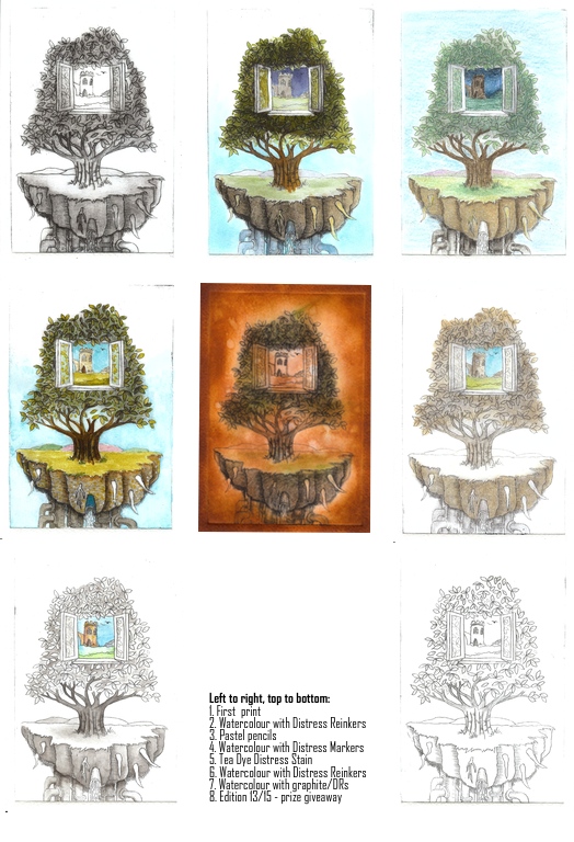
As I mentioned in my original post, I planned to further work on my drypoint prints, adding tone and colour. Here is a gallery of the results – and the bottom right is the print I have given away, number 13 of 15 – and may be the winner will want colour added? Most of these are now mounted for the end of term exhibition. There are some other prints available to purchase if you’d be interested…
I think some work better than others – I’m not happy with the tea dye one, it’s too dark. I am happy with the greyscale/monotone trees with the colour window. The pastel is very much in keeping with Jacek Yerka’s work on which this is loosely based as he prepares his paintings with a pastel version first. Let me know what you think 🙂
It’s ‘Less is More’ challenge entry time again, and this week, being the first in the month, it’s a colour theme: yellow. I had in mind for last week’s sketch challenge to do a frame with 3D flowers in, but didn’t end up having enough time to make it. So here’s the same plan, with yellow flowers!
Our theme across all our activities this term at college is ‘influenced by an artist’. I’ve chosen the Polish surrealist Jacek Yerka to base my work on, and for print I was asked to do a drypoint. I discovered this is an etching process where the ink is trapped in the grooves and burrs made by scratching onto metal or acrylic and then transferred onto the substrate using pressure. I scratched my drawing onto a sheet of clear acrylic sheet (approx. A5 size), applied etching ink (which is very viscous), removed most of it, and then printed onto previously wetted watercolour paper using an etching press. Any ink left on the acrylic gets transferred to the paper, so removing it from where you don’t want it is quite laborious! I was sooooo excited as the first print was revealed, and that didn’t really diminish as I did a limited print run. I’m going to have a go replicating it at home using one of the many die cutting machines in place of the etching press, and more common crafting inks. Here is the basic print, and I’ll be colour washing some in due course:
I’ve spent all afternoon on my still life homework for the holidays… an exercise in two point perspective. An hour of reading, a couple of outline sketches and some more research led to a couple of hours doing all the construction with vanishing points at the zenith and nadir rather than on the horizon line – but I kinda like the effect. It then took another hour or so to enlarge, trace and shade the image, and here it is. Those that know, feel free to critique!
If you remember, I had a giveaway at the beginning of March in honour of this ‘ere blog’s first birthday. The first prize was for the person giving the most comments and is featured here. The second giveaway was to the longest active subscriber to the blog at the 12 month point – and that was/is Shirley at 11 months and three weeks. I asked her what she would like as her commissioned artwork and this was her reply: “I have been looking through your blog and saw the ‘largest ZIA to date‘. I used to do a lot of counted cross stitch (until my eyes rebelled). Samplers was one of my favourite things. Would I be asking too much to have that as my prize?”.
Of course I couldn’t give that particular example away again as it was a unique piece for that particular giveaway. So I’ve created this one instead, including some of my new Faberge patterns and using my first attempt at a Celtic Knot. It’s a biggie again, being A3 sized, and took almost 6 hours to complete. Well done Shirley, I hope you like it!
I’ve just finished designing my fifth tag in my Twelve Tags for 2012 series. This one features a distress stain background using techniques I learnt on my recent Tim Holtz’s Creative Chemistry 101 course, as well as air dry clay Lily of the Valley flowers. I love it when a plan comes together – I couldn’t find a stamp that I liked enough, so this was Plan B and I am rather pleased with the outcome, even if I do say so myself! I’ll be demonstrating how to make it and an accompanying card at the Manic Stamper Craft Club on 21st April. Instructions on how to make the tag are now available here.
I had an ‘interesting’ day yesterday at the fantastic Coleman’s Craft Warehouse Big Demo Day. I was billed to do a make and take with the Martha Stewart Craft Paints on Ceramics, but there was an unexpected influx of young children which resulted in me being asked to lead a children’s party next week! (I declined!)
That said, I’d done plenty of preparation for the make and take and here are pics of my samples. The plates are technique samplers and the text is written with a porcelain marker. All of the samples were baked, and are dishwasher safe – I actually tested this claim before I agreed to promote the paints, and I can absolutely say it does what it says it will do! The paints are more adherent than most acrylics I’ve used, and though water based, the box says not to mix with water – I presume this messes about with the resin technology that makes them multi-surface. You can thin the colour with the glaze product that is in the same range of products, which is how I managed to get the wood grain effect on one of the mugs using a brush. I would recommend applying the paint with a sponge onto non-porous surfaces and you can use a heat gun to make a layer workable, although it is not as stable as if left for an hour or so to dry between coats. The frosted glass effect paint is also applied with a sponge and is one of the most user-friendly frostings I’ve ever come across.
The paint itself is a creamy consistency, dabs on well and has good opacity. It comes in four varieties – a Satin Finish which seems more matte to me, a pearlescent – which is striking, a glitter – which is more of a coloured glitter translucent glaze, and a high gloss. The colour range available is comprehensive and there are various special effect bottles that I haven’t had the opportunity to play with.
I’m particularly impressed with the range of accompanying accessories, including the fine applicator tip that attaches to the bottle (see the high gloss black outlining) and the sponge dabber tips that do the same. Ms Stewart has also included an empty bottle in the pack which is for rinsing out the caps when done with clean water. Clean up is easy – as long as you do it while the paint is still damp. The paint by its nature sticks firmly and to any surface. I found that the stencils retained paint even after cleaning quickly after use, but any dried paint didn’t shift with subsequent applications.
To be honest, I’d probably use other acrylics for painting porous surfaces, but I’d certainly recommend these craft paints for any non-porous surface.