Powertex sculpting with Harry

I had the pleasure of a request to tutor one of our friends’ sons over the summer. Harry is 12, and has joined me in the studio for two hours each week and for his final two sessions we decided to make a statuette of his favourite video game figure – Link from Nintendo’s Ocarina of Time.
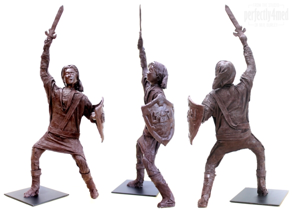
Harry Clayton's LinkThis statuette stands just shy of 50cm/19″ tall and had a wire frame, foil and polystyrene structure covered with masking tape to bind it all together before covering with Powertex bronze. The next layer was Powertex soaked fabric before piecing the tunic, cuffs and belt/bandoleer combo. We made the shield from Powertex ‘clay’ and dried it over a jam jar to set the curve. The same clay was used to form the sword and both hands, with the sword supported by a wire centre. The shield was connected by using Powertex to glue to the fist and elbow and a supporting fabric structure in the centre, supported while drying.

Harry preferred to not use the metallic pigments which would have given a more bronze-like feel, and we’re both delighted with the outcome! I’m impressed with the versatility of Powertex and the flexibility of the fabric really lends a sense of moment and dynamism in the final piece.

It’s another giveaway…

I snuck in some ‘me’ crafting time at the end of last week, and spent 10 or so hours creating my next blog giveaway. As promised, I am going to celebrate 250,000 views on this ‘ere blog soon, and in honour of this will be giving away a piece of unique art. Here’s a sneak preview…

Just a sneak preview...All you have to do is leave a comment (constructive, spam won’t count!) somewhere on my blog – whenever I notice the views click over the 250,000 mark, whomsoever has made the most recent comment, gets the prize! It’ll help if you sign up for email updates as I shall be posting regularly between now and then…

Come & Craft / Stash Buster Clinics

Facebook-stash-event-bannerI’ve just had a steep learning curve learning how to make Photoshop data merge to create date buttons… all in pursuit of allowing you to book to join my Tuesday evening craft sessions! A full list of dates between now and Christmas are now available to book online over at my workshops page.

And don’t forget I have an Open Studio over the bank holiday weekend, from 10am to 4pm each day. Just drop-in, preview the upcoming workshops, sign up and pay 🙂

Two new workshops added

I’ve just updated my workshops page with two new sessions:

Make Your Own Embellishments – Saturday 5th October (£25)

A day of demonstrations and practical hands-on experience making your own embellishments for card making or scrapbooking: includes tips and tricks for colouring, moulding, shrink plastic, customised ‘metal’ tags, paper and fabric flowers, colour coordination and embellishing die cut lettering. If you have a layout in mind, bring your photos and make your own bespoke embellishments to match.


Painting with Powertex – Saturday 2nd November (£50)

African SceneIn this session we’ll be using Powertex (a specialist pigmented liquid fabric hardener) as a paint. You’ll explore building up layers and texture on canvas and on a frame, making a complementary air dry clay to create figures or shapes to embellish your piece, and learn techniques to colour your pieces further with powered pigments.


For more details, pictures and to book online, go to my
workshops page. Full terms and conditions are also available using the link at the bottom of the same page.

Shadowpainting with Distress Reinkers

I’ve liked shadowpainting for some time now, but never seem to use the latex-based masking fluid before it all gunges up in the bottle. It helpfully says on the label to dilute with ammonia to get it liquid again… but I just don’t seem to have that lying around!

Meanwhile, I’ve used WOW! Bright White embossing powder on watercolour paper to do much the same thing – it’s a lot quicker as well using a stamp rather than tracing patterns with latex gunk and waiting for that to set. I’ve used Distress Inks (from reinkers) to colour each of the images. I’ll be teaching the technique at the Manic Stamper Craft Club in Leicester on Saturday 🙂


Envelope – tangle pattern

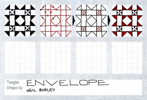
I recently read an article on how to use the inners of envelopes in collages. You know the ones – those with the printed security pattern that is meant to help obscure the contents. Well this got me thinking, and on receipt of the next missive from the bank, I had a quick look at the pattern inside the envelope. Two tangle patterns resulted, and here’s the first:

Envelope - tangle pattern


By definition this is more like a zentangle pattern than most I have done, as there is a continuous line in step one to form the main pattern, with only ornamentation to finish it off. The arrows show the direction the single line goes, with four motifs shown.

This actually isn’t anything like the pattern in the envelope – that’ll be next weeks release 🙂

Continue reading

Colouring the way nature intended…

Challenge time again over at the ‘Less is More’ blog, and this week it’s the colour theme: they’ve used this fabulous picture from Design Seeds to define the colour scheme –

ThankfulTones

I decided to colour match the swatches using Versacolor small inkpads and came up with the following colours: Cement, Bisque, Khaki, Charcoal and Umber. They are close matches – as always with colour matching, each monitor, printer and eye is different resulting in all sorts of different interpretations. I also noted that the wet inks are significantly different to the dry…

But here’s my challenge entry – one of my favourite stamps (from Hero Arts I think) along with the label and sentiment from Tim Holtz/Stampers Anonymous:

With Love

I inked all over with the Umber, before removing ink over the various plant parts using a tissue or wet wipe. I then carefully inked in with the other colours – the small ink pads come in handy. It would have been a one layer card, except I didn’t notice the first impression of the label had a filled in centre… overzealous inking with a new pad!

Update: 16-Aug-13
This card was chosen as one of the showcase ‘winners’ on the challenge blog 🙂


Faux Stained Glass, Art Nouveau Style

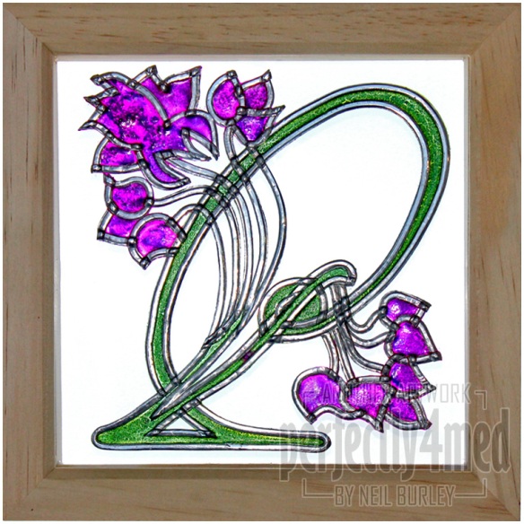
It’s another WOW! Embossing Powder Challenge, and my design team post this month takes their ‘Art Nouveau/Art Deco’ theme as its inspiration. I studied the period and art for a time whilst at college, and I loved the classic whiplash shape, the stylised botanicals and especially the stained glass. Here is my homage, using self-adhesive lead and embossing powder as my only materials (other than the 6×6″ deep frame…). More making instructions over at my post.

Faux Stained Glass