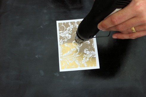
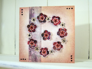
For those of you that aren’t familiar, or are a bit rusty at, or may be just want to have some good tips and tricks to improve, I’ve written a photo guide to heat embossing for beginners, complete with troubleshooting tips. It’s over at the WOW! Embossing Powders blog if you want to know more.
Tag Archives: tutorial
WOW! New stamps and a shadow box
I spent this morning playing with the new WOW! stamps, combined with a Tim Holtz 6×6″ configurations box, and came up with this:
WOW! Some new stamps :)
Very exciting news – WOW! Embossing Powders have new stamp designs available. Here’s a quick card showing some of them, with a minimalist design suitable for beginners.
I’m entering it into the ‘Less is More’ one layer challenge this week as well. I’ve prepared an instruction sheet ready for the Hobbycrafts show at the NEC, Birmingham (22nd-25th March) – here – I’d love you to have a look and let me know if it’s clear enough!
An old magazine and a bit of Brasso?
Recycling is all the rage these days – apparently making something you’re about to throw away into something useful and beautiful is now known as upcycling. Here’s how to upcycle a glossy magazine page into a pretty greetings card using Brasso, embossing powder and a bit of elbow grease.
Self-closing box instructions
Following several requests (well, at least one!), here are instructions for making my self-closing box using the printable template on my Template page.
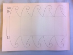 Either print or trace the outlines from the template onto a sheet of A4 card (at least 160gsm recommended)
 Using a scoring blade in your personal cutter, or an embossing tool or other scoring technique of your choice, score the dotted lines
 Crease all the scored lines, folding upwards. Add a strip of double sided tape to the underside of the tab (red strip in photo)
 Stick down the tab to the inside (printed) side of the last (right hand) section of the box, to make a pentagonal cylinder
 The tags tuck under one another to close the box – you should end up with a nice swirl. To unlock, just pull one of the hooks from the rest. By doing the same top and bottom, you can create a horizontal box like the centre of a Christmas Cracker
 If you want a vertical standing box, try tucking the hooks toward the inside of the box – this is tricky and fiddly, but gives this smooth bottom closure
Christmas Tag Cards
Here’s what we did at Craft Club last Saturday: I’d have posted them sooner, but they weren’t perfected until late the Friday before! Read on to find out where the pitfalls are…
Image transfer from wallpaper – technique tips
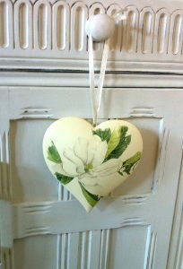 This started out as a cream coloured ceramic heart from Dunelm and has had the magnolia image transferred onto it. The image comes from spare wallpaper used to decorate the room – an ideal way of making complimentary accessories.
Perfect Pearls – demo board
Hi all – I’ve been feverishly working away the last two days getting ready for my next demo/workshop day at Kim’s Crafts (Hinckley Branch) on 10th September. In the morning, I’ll be demo’ing all things Perfect Pearls (from Ranger) and this is the demo board I’ve just finished.
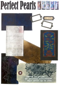 I’ve just found it’s next to impossible to photograph pearlescent finishes! But the board shows the basics of applying perfect pearls to medium, then painting on a pearl finish to spritzing with distress inks, stamping over distress stains and inks, and bottom left, applying to UTEE and watching it ooze.
Paper Towel Printing – Distress Inks
I’ve carried on playing with my newly discovered technique, and thought I ought to try Paper Towel Printing with distress inks. Here’s a step by step guide:
 Firstly, place your sheet of paper towel onto a glass mat or other non-absorbent surface. Wet by spritzing with water.
-=-
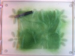 Then I spritzed with homemade glimmer mist spray – good to have a background colour. I think it also helps the other colours keep in their place… This one is Peeled Paint with gold perfect pearls.
[To make your own mist – take one dropper full of reinker and add it to a mini-mister. Add a small scoop of perfect pearls. Fill with water to three quarters full, replace cap and shake vigorously. Spritz.]
-=-
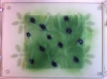 Drop on ink from your choice of distress ink reinker – this is Faded Jeans.
-=-
 Spritz each of those dots with water until they start bleeding.
-=-
 Repeat with more colours – this is Spiced Marmalade.I also added Dusty Concord.
Spritz with water.
-=-
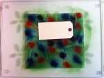 Start printing! Lay a tag/paper/cardstock/ATC on the towel and smooth down with your fingers. You may see water squeeze out of the edges at first – that’s what you’re after 🙂 You’ll also find the colours start to spread a little more into one another.
-=-
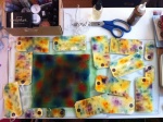 All of this from one sheet? Yup – and they are all double-sided as well. It seems that the colours stay pretty much where you put them, so this would be great to carry a colour theme throughout a tag book, or art journal, or across several pieces of cardstock for scrapbooking or card making.
-=-
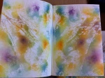 And there was still some left over to do my art journal 🙂
-=-
 Close up of the tags – they’re a bit blotchy still as I didn’t wait to dry them before sharing this blog entry with you! Lots of texture on some, lovely watercolour effects. Love it!
1930s Style ProMarker Tutorial
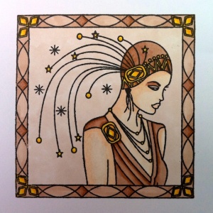
I’ve done some more ProMarker colouring, and thought I’d post the steps and pens used. Let me know what you think and if you’d like any more. The image is a stamp from Circa Designs, VA-IM-11 1930s lady in frame (big), available from their website which is listed on the suppliers page. Apologies for the photo colouring – I’ll find my tripod and decent lighting next time.
Completed image

