Ever had the problem of Stickles glitter glue, or Liquid Pearls, getting to the last dregs? You know there is more in the bottle, but even the hardest wrist flick doesn’t get it down to the nozzle. I have – and being a crafter and ridiculously frugal, I thought of a solution. And as a crafter, I’ve spent out more money than I save on getting the right tool for the job! Introducing the Stickles Spinner Mk I:
Tag Archives: stickles
Art Journal Page: Pick A Stick Challenge [January]
Gah! It’s so frustrating when you write a blog post and then there’s a glitch and it’s gone and even the saved drafts don’t seem to exist any more… so for the second time of writing:
During the week I was invited by an online friend I got to know through the Creative Chemistry 101 classes a few years ago to join a new art journaling challenge group she was organising. The Pick A Stick Challenge Group on Facebook is open to anyone who would like to join in and is an active art journaler. The premise is simple: each month, ten sticks are drawn at random from a pot of prompts covering media, styles and techniques. The only other stipulation is that you layer your page in the order the sticks are drawn. That is where the process becomes a little more tricky!
It’s all the presentation: perfect packaging 2
I’m still in making mode ready for my church’s Christmas Fayre at the end of November. I’ve decorated these pre-made metal blanks and made them into brooches by using an epoxy glue to stick on the brooch clasp – details on the decoration are here.
I wanted create a bespoke presentation box to show them off at their best – it just so happened I could use the same size for the peacock and the dragonfly. Designing started with a 3×2″ base. I added ½” sides and tabs. For the lid, I enlarged it slightly, adding the thumb divots in the centre to aid taking the lid off. To raise the base (and create a hidey-hole for my business card), I designed a stage slightly smaller than the base, with ⅛” supports at the side to hold the item off the bottom and the holes with a slit between allows me to press the brooch back through and fix the item in place. Two boxes come from an A4 sheet of card, cut on my Silhouette Cameo. For placement of the holes/slit, I pressed the item down onto a piece of card, and was able to see a dent where the clasp and hinge of the brooch back were. A bit of triangulation later, and the hole placement was perfected. This was ideal as the brooch clasps were in roughly the same position on each item – it would have been much less practical for several different placements.
Background Check: Day 6
It’s the final day over at the Background Check class, aside from the wrap up day. It’s another design break to allow us to make cards using the background techniques we’ve learnt over the previous two days. I’ve snuck into the studio and made my Day 5 backgrounds into cards:
For these cards, they’ve only needed the addition of a little sparkle to accentuate elements on the background, with the sentiments done on my trusty Dymo machine. Again, that’s not been out for a while, and it was the letter press (get it?) technique that prompted its use. It’s been a great course, well worth the sign up fee – if only to have had the impetus to use some loved, but forgotten, techniques and refill my card drawer!
What I did at the weekend…
 This gorgeous bird started out as a £1 plain brass charm at the start of Saturday morning. It’s only 7x5cm in size, but had the dimples ready for the cloisonné effect additions of Stickles Glue (Stardust, Peacock & Lagoon), Juniper Liquid Pearls and some Glossy Accents. So by the end of Sunday, this was the final result. I need to make sure I get to the rest of them, so I’m staying quiet as to where I found it!
I also completed two more art journal pages – another for my Carabelle Studio stamps demo, and the second featuring new stamps from Tim Holtz. This page had several layers of paint and distress stains to start, and then I augmented it with the ‘Pretty Like A Flower’ stamp, with distress markers. It’s the first time I’ve used PanPastels to tone down a background, fixing with a quick hairspray. Which by the way causes archival ink to swim about, so the gesso layer got thicker to cover that learning moment…
Iridescent watercolours really make the embossed butterfly zing – but beware when drying the previous page – the embossing remelts and distresses both the artist and the facing page somewhat!

Beary Special Christmas
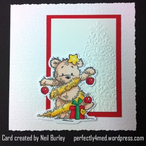
It’s Passion for Promarkers challenge entry time again, and this week the theme is ‘beary special’. A friend mentioned this afternoon that it’s less than 100 days to Christmas. And crafters have to start early… Here are my entries to the challenge.
Park Life
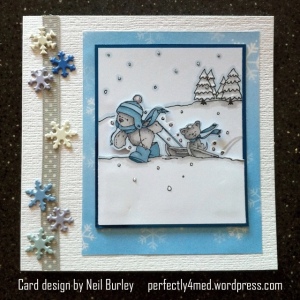
This week over at Passion for Promarkers, the theme is ‘park life’ [Week #105]. It’s currently the hottest day this year here in sunny Leicester, so my view of park life must be wishful thinking for cooler days? It’s perhaps not quite the summery image that many would be conjuring up, but I remember the fun of sledging in the park and the stamped image was perfect.
Glossy Background Variations
This is this month’s project for a card crafting workshop afternoon I teach on the third Saturday of each month in Leicester, UK. See my ‘about me’ page for more details.
Distress ink was applied to an A4 sheet of glossy card using a brayer: broken china, dusty concord and worn lipstick. I then cut the sheet into quarters and left one quarter as was [flowers]. The second quarter I sprayed with water and allowed to dry, giving a speckled bleached look [butterflies]. The third quarter I wiped some of the ink off with a baby wipe, before using a scrunched up vinyl glove to apply the same colour inks from the pad to the card to get a wrinkled look on a bleached out background [lily/gems]. The final piece was dabbed with a scrunched up moist baby wipe, again producing a bleached effect [tree]. Each piece was cut in half again (ie eight pieces from one A4 sheet). Images were stamped on with either black or opaque white Stazon ink, and matted onto bazzill cardstock. The tree foliage in this example was added after stamping the tree silhouette by dabbing ink on using the scrunched up vinyl glove (a scrunched up plastic bag or cling film would work as well). The gems on this occasion are dabs of Stickles glue in coordinating colours – but hotfix rhinestones or self-adhesive gems would work far better.


