As if that wasn’t enough… some typography & chalkboards

There’s just one day left before the Christmas Fayre (in case I hadn’t mentioned it recently). Though I have more items than I can fit on even a large table, the inspiration hasn’t stopped. I thought I would have a go at some mounted typography, so designed, cut out (ok, the Cameo did that bit), stuck together and mounted these two examples – which happened to be two verses from Sunday’s morning services (see the sermon sketchnote).

Meanwhile, on the other side of the table, I’m finishing off some MDF chalkboards – three down (one featured here), three almost done. The first is covered in old dictionary pages, and aged with a ‘dirty wash’ – a drop of DecoArt Media Raw Umber and a drop of Quinacridone Gold watered down, brushed over and splattered with water before drying and sealing with DecoArt Media Ultra Matte Varnish. The second started with squidged Distress Paints, sprayed with water, then dried and I used DecoArt Media Phthalo Blue as my dirty wash, before glazing with a watered down metallic blue acrylic paint. I then sealed with a gloss varnish with a bit of DecoArt Media Interference Blue mixed in. And the last – I’ve tangled it in Sakura Micron 08 black pigment ink over Dylusions Linen White paint (which when completely dry doesn’t clog the nib), sealed with DecoArt Media Ultra Matte Varnish.

[Disclaimer: as part of the DecoArts Helping Artists Program,
I have been provided with samples of their products to use for projects]

Continue reading

Make your own custom wax seal

Last weekend I went to a craft show, and amongst the ridiculous amounts of dies I noticed a dip pen and wax seal stand. Wax seals have a sense of class, of authenticity, of originality, even in the electronic age. And I’ve wanted my own for ages (my faux ones still didn’t quite hit the mark), along with some of the gorgeous pens. But where would be the originality be in a mass produced metal wax seal stamp? It was at that point I thought – I could make my own, couldn’t I? Thus started another steep learning curve (in between doing all the glass etching).

IMG_6350_w

Continue reading

Glass Etching with Armour Etch

IMG_6347_w

I have learnt three things on this little project:

  1. Etching glass with Armour Etch through a vinyl stencil that I cut on my Silhouette Cameo is quick, simple and delightfully effective. This inexpensive Ikea glass is now carrying the branding that I use for my studio.
  2. Photographing glass, like mirrors, is incredibly tricky! I spent roughly 15 minutes etching the glass, and then the next hour learning how to take the photograph! I ended up lighting it from beneath with a small LED push-light with a sheet of paper between it and the glass to dim it slightly. All of this was in a blackout tent, with a small amount of light from above, and poking my phone through a small slit in the tent. The first attempts had so much reflection of both the lighting and the surroundings, the etching wasn’t visible.
  3. Cleaning the glass digitally was so much more effective than in real life. I’d done my best using alcohol and non-shedding cloths, but the pesky dust specks really showed up despite my best efforts. The Spot Healing Brush in Photoshop really came to the fore to remove them. Though not perfect, I think as a bit of amateur product photography I can get away with it 😉

All that’s left to do is the rest of my glasses!

Continue reading

Background Check: Day 4

BC_participantYesterday’s class was all about die cutting and how to use them in backgrounds. Now I’m not that much of a fan of die cuts, especially the confetti that covers everything with the really intricate ones. I decided to use a different approach, and cut out my cards using my Silhouette Cameo and designed my own shapes inspired by the dies used in the class.

The first is coloured with ProMarkers, and the second shaded with Picked Raspberry Distress Ink. The third is just the white cut out on a cream card – I think it’s a rather classy clean and simple design.

Continue reading

Bunny Friends with Chameleons

IMG_6121_w

I’m not normally one to be grabbed by a ‘cutesy’ image, but this new rubber stamp from Penny Black / Margaret Sherry (dated 2009, so re-released?) definitely caught my eye. It’s one of those stamps that comes with a coloured image on the wooden block, which really helps those that need guidance on colouring in. I’ve used my Chameleon Pens to colour these in, which really came into their own for the shading on the pots. It took a couple of goes to find the right combination to get a good terracotta colour, which is why the pots are different colours between the two cards. The lettering is cut on my Silhouette Cameo – I found I need to set the cutter to ‘deep cut’ on the on-board screen, which meant the little serifs didn’t end up tearing.

Bespoke Wedding Invitations (Part 1)

The hardest thing about keeping my blog up to date with my crafty exploits is that some of my work has to be kept under wraps until the special reveal. So there may be times when I seem to be quiet – but in fact working frantically to meet deadlines!

Today’s post is one of those. A good friend asked me to make her wedding invitations – and now they’ve been sent and received, I won’t be spoiling any surprises 🙂

IMG_5773_w

Both Jess and Stuart are real ale aficionados, and we’ve spent hours together working our way through the bar at the Peterborough Beer Festival. What more fitting then than a personal hand pull badge? I drew the hand pull from reference photographs, and then scanned it and coloured it in Illustrator. The badge was designed in a combination of Photoshop and Illustrator. After creating print proofs, cut lines were created in Illustrator and sent to Silhouette Cameo using their Connect plug-in. It was then a matter of assembling the parts using 1mm deep foam pads to add some dimension (and allow avoidance of large letter postage).

By my reckoning, one can measure how successful a job has gone by whether more work is commissioned as a result. Happily, the couple are so delighted, I’ve been asked to adapt the design for the reception table labels.

Congratulations to the happy couple, all the best for the day, and here’s to another reunion at Peterborough in August 🙂

Continue reading

Cheap vinyl lettering for mixed media?

IMG_5380

I’ve been playing with an idea I had a while ago, but only just had chance to try. I was struck by how sticky some of the low tack tapes can be, and then happened to use some electrical insulation tape and realised that it was that perfect stickiness for peeling off things. And it was waterproof. And relatively cheap. And just the right width to fit a line of text in suitable for art journaling. Combining these thoughts with a Silhouette Cameo PixScan sheet led to the following experiment…

Continue reading

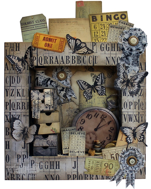
Timeless Deep Frame Assemblage (for Jones Crafts)

Timeless FrameThis one was a bit against time… despite being the Timeless Collection from Kaisercraft. I got the kit on Tuesday and it needed to be done in time to take to the NEC today for the CHSI Trade Show. Well, I prevailed, and it was done by Thursday afternoon 🙂

The frame is Candy Box Crafts’ 6½ inch one, and is really easy to assemble. I created my own template for cutting out the covers which wrap from the back, round the front, and to the inner sides. Just so happened I sent it to my Silhouette Cameo to cut out so that I could keep the paper orientation the same. The rest is just using the various papers, ribbons, printed tape and collectables with copious amounts of Pumice Stone Distress Ink. The drawer sets are shrunk down Silhouette templates from Lori Whitlock cut from the Timeless Collection papers. Buttons are from the Jones & Co. Horn Value Pack.