Take three stamps…

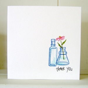
Take three stamps, add a little bit of colour magic and hey presto, another challenge entry! Well two, I couldn’t make up my mind which I liked best… It’s one layer week at ‘Less is More’ and the stipulation was to use three stamps, not two, not four, three. There’s precise for you!

Hero Arts Long Writing Background (F2674) in Frayed Burlap DI
Impression Obsession Textured Evening Gown (D4320) in Sepia Archival
Sentiment from WOW! Everyday Sentiments Clear Stamp Set in Jet Black Archival

-=-

Inkadinkadoo Arrange A Bottle Cling Set
WOW! Everyday Sentiments Clear Stamp Set stamped in Jet Black Archival

Bottles: Manganese Blue Archival, shading with Tumbled Glass Distress Marker
Flower: Tea Dye, Walnut Stain, Peeled Paint and Worn Lipstick Distress Markers

Yellow Flowers and a White Frame

It’s ‘Less is More’ challenge entry time again, and this week, being the first in the month, it’s a colour theme: yellow. I had in mind for last week’s sketch challenge to do a frame with 3D flowers in, but didn’t end up having enough time to make it. So here’s the same plan, with yellow flowers!

Continue reading

Father’s Day Card

It’s not long until Father’s Day (at least in crafting days) on 17th June, and I created this card for my monthly slot at the WOW! Embossing Powder blog as part of my design team responsibilities. The theme is month is Earthtones and ‘manly projects’! If you want details on how to make the card, here’s the link. And don’t forget their really easy to enter challenge!

Spritzing, Stains and Sketches

I did get to making some cards this afternoon after the marathon quilting session yesterday. I’ve had a go at combining a couple of challenges again – the ‘Less is More’ sketch has a square centrepiece and sentiment, with lots of white space recommended. The other challenge is a new one to me – a ‘Seriously Creative Challenge’, hosted by Creative Accents, to do something with stains or sprays. Here are my creations:

As you might guess, the results of my experiments can be somewhat variable! The sprays used are Dylusions Ink from Ranger in Black Marble and I used Bubblegum Pink on a Magenta stamp as a watercolour stamp ink. I can guarantee my fingers are stained, as is quite a lot of stuff on my desk – the overspray is a nightmare – until I decided to create a spray booth in a cardboard box. The sentiments are all printed in Archival Jet Black and are from the WOW! Everyday Sentiments clear stamp set.

Three Shades of Green with a drop of yellow

It’s ‘Less is More’ challenge time again – and this week I’m a little earlier than I have been for the last couple of times! The first week of the month theme is colour, and they’ve set the task of creating a clean and simple card with three shades of green. I used the Hero Arts ferns set of stamps, and Shabby Shutters, Peeled Paint and Forest Moss Distress Inks. A spritz of water, punched flowers and a few drops of liquid pearls and here’s my entry:

Spring { petals }

It’s Lucky Dip time over at the ‘Less is More’ challenge, and this time they have set a colour theme based on one of the fabulous Design Seeds schemes:

I decided to make my card with ProMarkers again this time, and picked the closest matches in colour: Cool Grey 2, Grey Green, Meadow Green, Blossom and Rose Pink. Here are three cards that I stamped and coloured using the set colour scheme:

Less Is More: Take Three Challenges

It’s been tricky to find five minutes this week to sit down and do the ‘Less Is More’ challenge card – but I managed to get it done just before the closing time this evening. The theme this week is ‘take three challenges’ and my card fulfils these three past rules:

  • Week 4: Three Squares
  • Week 20: Monogram
  • Week 31: Metallic

Of course, the observant will note there are four squares… I didn’t notice I’d used a square card until it was all done and put together! Hope that doesn’t count toward the total number… The monogram was an accidental discovery – I triple embossed in WOW! Metallic Silver Ultra High and stamped my signature monogram into it. I then tried to catch the raised parts with Ranger Archival Jet Black ink, but missed, so carried on. Rubbing it back has produced this fabulous gunmetal finish. And I’d forgotten how tricky it was to photograph metallic surfaces!

More butterflies – and the odd moth

I’ve had a creative day today – and this is one of the results. I’ve used the new Attic Treasures stamp from Tim Holtz, masking tape, Promarkers and a Letrajet attachment, a bit of Letraset metallic tape and a few stick on pearls. I’ve kept it clean and simple to enter the ‘Less is More’ masking challenge this week, and the colour scheme fits the ‘Passion for Promarkers’ yellow and pearls challenge. Oh, and me being me, I looked up each of the winged things on the interweb to find out what colours they should be…

I’m thrilled to be showcased over on the Less is More blog for this card – what an honour to be the first LIMister!