So grateful summer’s here…

Though everything was a month late at the allotment this year, I did actually have blossom on the fruit trees, unlike last year, and some fruit has set. Unfortunately, the cherry tree is still having problems and I have just one cherry ripening. Not so on this card for The Crafting Cafe, featuring LEJ Designs ‘Blossom’ digistamp:


For more details on how I made the card, check out my post over at The Crafting Cafe.

Mixed media cards

It’s demo time again for the Manic Stamper Craft Club, and I’ve spent the last four sessions teaching various techniques, including distress inks, image transfer, acrylic paints and myriad other art materials. There was a request that we take time out this month to put the techniques into practice, so I’ve spent a while in the studio coming up with these three cards:

The bath time one features image transfer, distress inks, and faux rusted enamel technique. The flowers use acrylic paints for background, stamping, tinting and covering metal embellishments. The final card uses the Ranger Summer Palette Challenge colours in distress inks, stains and alcohol inks as well as a bit of shine from Perfect Pearls, trying the capture the long car journeys for our summer holidays! Hopefully they’ll be enthusiastically received as examples of mixed media chemistry šŸ™‚

Embellished embossing powder moulding

IMG_3652


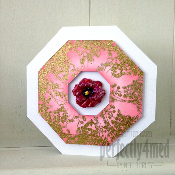
It’s a ‘Nature’ theme over at WOW! Embossing Powder Challenge blog this month, and for my design team contribution, I’ve used their pansy mould to make and embellish the centrepiece – all made with embossing powders. For a mini-tutorial, follow this link


Blue Hues in a Can

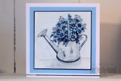
It’s a ‘Favourite Colour’ theme over at The Crafting Cafe, andĀ I decided my favourite colour this month is blue, and used the fabulousĀ Floral Watering CanĀ from their sponsorĀ Delicious DoodlesĀ for my base image. I recently fell in love withĀ Letraset AquaMarkers, bought the entire set, and played with them some more for this card.

I started by printing two copies of the image onto 90gsm watercolour paper using my laser B&W printer. I added AquaMarkers to the crosshatched areas of the design (as these will be the darkest) and dragged the colour across the rest of the space with a waterbrush pen. I added extra layers of colour where needed by allowing the first layers to dry before painting on colour picked up from a palette (draw on a plastic sheet with the AquaMarker). That’s how I built up the mottled watercolour effect on the can and the shadow.

For added depth (not easily seen on the pic) I coloured in the second copy and cut out selected items, edged them in black and layered them decoupage stye onto the flowers. Try to choose things that aren’t overlapped by anything else and you’ll get the foreground elements perfectly.

Pens used:
Can – Pebble Grey
Flowers – Deep Sapphire/Storm Blue/Vintage Blue/Mediterranean
Background – Pebble Grey/Frost Blue

Mounted on black card over Bazzil on 14x14cm ‘linen’ style card. The metallic strip at the bottom is by Letraset and helps ground the image.

Let me know if you’d like a more in-depth/video tutorial on using AquaMarkers. I think they’re fab!


Brown & Pink Inverse Cards


Well I don’t think these will win any prizes! They are a quick and somewhat crude card, using punches and Bazzill card stock. What’s punched out of one, fits into the other. The colour strips were added on top, and the sentiment is cut using the Cricut Opposites Attract cartridge. I made them for a quick entry to the Less is More challenge, and I think they show I’m a little out of practice!

Pumpkin Monster Card

I still don’t ‘do’ Hallowe’en, but when you’re on a design team, you have to do what you’re told! I’ve created this card for Wow! Embossing Powders for their Hallowe’en theme this month, and used several different mixes to get the shading. Find out more here. And the template for the pumpkin sections can be found on my templates page.

Pearlised custom patterned card

The design challenge over at WOW! Embossing Powder blog this month is ‘monochromatic’ and featuring their fabulous pearlescent powders. This is what I came up with, and if you’d like to find out how I made the pearlescent background card/gift box lid pop over and read my post.


Jubilee Tag

I’ve been away from the computer for a little while – last weekend was doing the Yorkshire Three Peaks for the first time, and this weekend I was meeting up with some of the team down at WOW! Embossing Powder HQ. I’ve also been working on some hush hush commissioned work, which with college work has left little time for playing. I did manage to squeeze in some quality time with my embossing powders though to reprise my June Twelve Tags of 2012 tag in embossing powders. For more details on how I did it, pop over to the WOW! Embossing Powder blog.