Our monthly colour theme has come around again at Less is More clean and simple card challenge. This time it is ‘black and light purple’. I’ve taken the set palette literally and haven’t even used white (which is allowed). A top tip from the outset is to not try stamping an outline onto textured card stock… Here’s my make:
Tag Archives: bazzill
LIM DT: CASe Card
Lots of abbreviations today in my post title: LIM – Less is More, a challenge blog for CAS – clean and simple cards or projects. DT is short for design team – a number of crafters who publish inspiration for the challenges every fortnight. Finally, we have CASe which isn’t really an abbreviation as such but comes to mean copy elements/everything from a starter card. This time, Elaine has given us our starter for ten with a lovely watercoloured rose theme. Alongside is my take on her card…
LIM DT: Colour Challenge
It’s a new theme over at Less is More Challenge blog – this time it’s a colour challenge. We’re looking for clean and simple cards with Fuchsia, Yellow and Grey as the colour combo. There’re plenty of cards from the design team to give you inspiration, and there’s a prize drawn from all the entries at the end of the challenge. I’ve done three cards this time – I hope you like them!
ProMarker Challenge: Three Beach Huts
Over at the Passion for ProMarkers challenge blog this week is the theme of ‘three of something’. I had a rummage through my stamps and found all manner of fours, fives and sixes. Eventually, I found an often used, but not recently, Michael Powell stamp of three beach huts. I love his style and when I was making cards, used several of his other stamp designs.
Beary Special Christmas
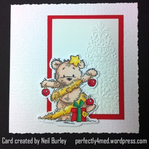
It’s Passion for Promarkers challenge entry time again, and this week the theme is ‘beary special’. A friend mentioned this afternoon that it’s less than 100 days to Christmas. And crafters have to start early… Here are my entries to the challenge.
ProMarker Embellishments Card
This week’s challenge over at Passion for Promarkers is ‘make your own embellishments’ [Week 95]. I’ve used ProMarkers as part of each embellishment as well as on the main image. Hope you like it!
Glossy Background Variations
This is this month’s project for a card crafting workshop afternoon I teach on the third Saturday of each month in Leicester, UK. See my ‘about me’ page for more details.
Distress ink was applied to an A4 sheet of glossy card using a brayer: broken china, dusty concord and worn lipstick. I then cut the sheet into quarters and left one quarter as was [flowers]. The second quarter I sprayed with water and allowed to dry, giving a speckled bleached look [butterflies]. The third quarter I wiped some of the ink off with a baby wipe, before using a scrunched up vinyl glove to apply the same colour inks from the pad to the card to get a wrinkled look on a bleached out background [lily/gems]. The final piece was dabbed with a scrunched up moist baby wipe, again producing a bleached effect [tree]. Each piece was cut in half again (ie eight pieces from one A4 sheet). Images were stamped on with either black or opaque white Stazon ink, and matted onto bazzill cardstock. The tree foliage in this example was added after stamping the tree silhouette by dabbing ink on using the scrunched up vinyl glove (a scrunched up plastic bag or cling film would work as well). The gems on this occasion are dabs of Stickles glue in coordinating colours – but hotfix rhinestones or self-adhesive gems would work far better.


