It’s been a busy morning – very creative vibes. I was reading about gelatin(e) printing yesterday afternoon, and set a gelatine gel plate overnight. I managed to get the sheet more or less intact out of the baking tray using a smidge of hot water round the base and sliding it onto a glass mat. And these are the results of my first play 🙂
Category Archives: Original Designs
Paper Towel Printing – for art journals and backgrounds
I’ve been playing today 🙂 And one of the things I got playing with was a paper towel. I originally planned to dye it with acrylic paints/inks for decoupaging into my art journal. But one thing led to another, and before long, I’d ended up with what I think to be a totally novel technique – at least I haven’t seen it in all my hours browsing art journal techniques online. I’ll be calling it Paper Towel Printing, and this is the result:
Hit for Six
This week’s challenge at Passion for ProMarkers is ‘sporting marvels’ [Week #102]. I couldn’t find an image I liked, and being of a non-sporty inclination I don’t have any stamps either. So I created my own digistamp, tracing a picture out of Saturday’s Times newspaper, scanning it, tidying it up in an image editor and then printing it out onto coated cardstock before colouring in. The figure six and the ball were hand drawn. A couple of bits of ephemera (gleaned from the net, printed in colour and then distress inked), layering with foam pads, and the card is complete.
Incidentally I was one of the winners in their grand second anniversary draw last week 🙂
Creative Minds Are Rarely Tidy
‘Creative minds are rarely tidy’ – a rather wonderful quote from an unknown author. And it ought to go on to say that their workspaces are rarely tidy either! I was inspired to do this freehand doodle, coloured with ProMarkers, after reading an article in the current edition of ‘Cloth Paper Scissors’ magazine [May/June 2011] by Joanne Sharpe. She uses Copics for her artwork, but I reckon ProMarkers are just as good, though the Copic colour coding seems to be simpler than the ProMarker system. I drew the doodle using my fountain pen and Noodler’s Bulletproof Black Ink, but on normal 90gsm copy paper as it was to be a trial run… I carried on. I think the blending would be better on my favourite cardstock for ProMarkers (Ryman’s 200gsm coated card). And note to self: scan the doodle and heat set the ink before starting to colour.
Red, White and Blue Shoe
This week at Passion for Promarkers, their 100th challenge is ‘red, white and blue plus a charm’. It’s taken a few days of mulling over, and an hour in the construction, but here is my card. I didn’t want to go down the flag route and remembered bowling shoes the last time I was at the ten-pin skittles alley – you know the ones… laces that are too long, and they feel like clown shoes. They fit the challenge perfectly. The charm laced onto the shoe is ‘live’ – bound to encourage a bowling aficionado.
Cool Dude
Passion for Promarkers Challenge Week 99 theme: ‘for a teenager’. This DL sized card is my original design. The black base of the skateboard is wet’n’dry very fine sandpaper adhered to the card with Glossy Accents (a glue stick just didn’t do the job). The wheels and graffiti were drawn freehand, coloured with ProMarkers and given white highlights with white gel pen. The wheels are mounted on foam pads for a bit of depth.
Freestyle Peyote Bracelet
I started this bracelet in a workshop on freestyle peyote and some six hours later decided it was finished. The organic nature of the design allows for more and more to be added, so an end point has to be called at some point! I’m pleased with my first effort, but think I will use less contrasting tones for my next one, and perhaps not start with such small seed beads (they made for a very slow start!). I’m also going to need a sample wrist size for my starting length as mine are a little on the large size for a woman’s bracelet… Feedback and offers to purchase appreciated 😉
Glass Painting on Mirror
This is my first attempt at applying lead strip to glass and then painting to give the stained glass effect. The design was freestyle trial and error. The mirror is 20x20cm (8x8in) square. Of course, photographing a mirror without appearing in it turns out to be quite tricky – I think I will have another go in better light. In the meantime, I’m sure you get the idea! I’d love to have some feedback on this – what do you think? And if you’d be so kind as to complete the poll too (no obligation to purchase btw)? Continue reading
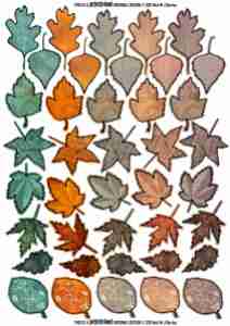
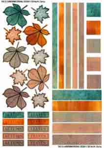
Art Journal Elements – Autumn
Ok, so it’s nearly spring… but the colours I’d used to make the background papers inspired an autumnal theme! This is my first attempt at creating decoupage sheets suitable for many things, but I had art journaling in mind when I came up with the sketches. Please feel free to print out the sheets and use the images in your own art projects. If you share the sheets, please make sure my name is still on them. The sheets may not be copied as a part or a whole to be re-sold in any format without my permission. I’d love to know what you used them for!
Click on the images to open an A4 size version that you should be able to save and print out. If you would like a high resolution version, let me know.


