Perfect in Pastels…

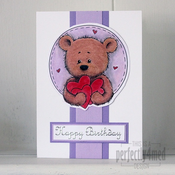
Bundle of Hearts in pastelsIt’s ‘Let’s Celebrate’ theme over at The Crafting Cafe this month, and for my DT post I chose the fantastic ‘Bundles of Hearts’ digistamp from , their sponsors this month.

I had a go at being a bit different, and decided to try and make the equivalent of an embossing folder to build up the image into an embossed one – it worked to a degree, but no where near good enough to run with, and then I ran out of time.

So I got out the PanPastels to colour in Benson Bear, adding shading and filling in the small areas with Derwent soft pastel pencils. I blended those in with a paper stump, which was also quite handy for moving the pastel off the laser-printed black areas. Any pastels running over edges were gently rubbed back with an eraser. I used a spray fixative to seal everything before assembling the card. The sentiment is a peel off, and the coloured card from Bazzill. I love the texture that the pastels give to the fur 🙂

And once I’ve mastered the art of converting a digistamp to an embossed image, I’ll let you know!

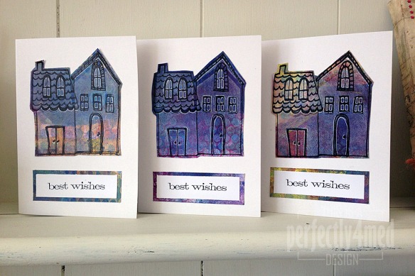
 

Gelli Print Trio – New Home Cards

I needed to stay awake yesterday evening, so turned off the TV, got off the sofa and disappeared down the garden to the studio. A couple of friends have recently moved house, so I decided to make them new home cards, which took about an hour (including tidying up after, which I’m determined to keep doing!):

Gelli Trio

The backgrounds are mono prints using my Gelli Arts printing plate, layering up lots of different acrylic paint colours through stencils, sequin waste and removing paint with bubble wrap and foam stamps. I overprinted with white acrylic using the Claudine Hellmuth ‘Dwelling’ foam stamp, then outlined with her clear stamp set and Archival Jet Black ink. The sentiment is from Tim Holtz/Stampers Anonymous  ‘Simple Sayings’ [CMS155] printed in Archival Jet Black and mounted on background offcuts to tie it all together. I outlined areas using a Signo white gel pen (fine tip) just to help define some of the detail.

Quick mixed media tags

I’ve got into the studio at last to do my own thing in between some craft room reconfiguration and college work! I’ve chosen to do some quick mixed media tags using mainly Ranger/Tim Holtz products:

Continue reading

Blue Hues in a Can

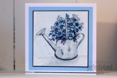
It’s a ‘Favourite Colour’ theme over at The Crafting Cafe, and I decided my favourite colour this month is blue, and used the fabulous Floral Watering Can from their sponsor Delicious Doodles for my base image. I recently fell in love with Letraset AquaMarkers, bought the entire set, and played with them some more for this card.

I started by printing two copies of the image onto 90gsm watercolour paper using my laser B&W printer. I added AquaMarkers to the crosshatched areas of the design (as these will be the darkest) and dragged the colour across the rest of the space with a waterbrush pen. I added extra layers of colour where needed by allowing the first layers to dry before painting on colour picked up from a palette (draw on a plastic sheet with the AquaMarker). That’s how I built up the mottled watercolour effect on the can and the shadow.

For added depth (not easily seen on the pic) I coloured in the second copy and cut out selected items, edged them in black and layered them decoupage stye onto the flowers. Try to choose things that aren’t overlapped by anything else and you’ll get the foreground elements perfectly.

Pens used:
Can – Pebble Grey
Flowers – Deep Sapphire/Storm Blue/Vintage Blue/Mediterranean
Background – Pebble Grey/Frost Blue

Mounted on black card over Bazzil on 14x14cm ‘linen’ style card. The metallic strip at the bottom is by Letraset and helps ground the image.

Let me know if you’d like a more in-depth/video tutorial on using AquaMarkers. I think they’re fab!


Demo’ing again – NEC 23rd-24th March

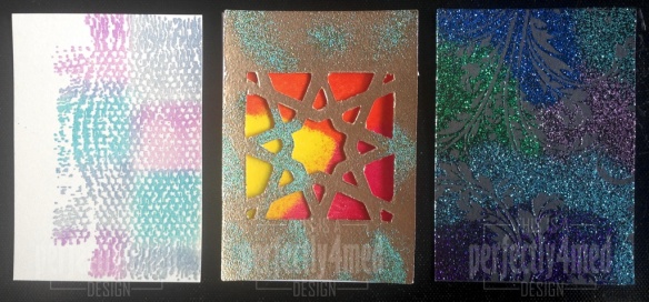
Hi all – I’m demo’ing again for WOW! Embossing Powders on their stand at the Hobbycrafts exhibition at the NEC this coming weekend. I’ll be there on Saturday and Sunday either on the demonstration table or leading the classes, so do come and say hello. Here are three samples of techniques I’ll be demo’ing – and apparently there will be new moulds to demonstrate too!

NEC samples

Tattered Flowers in a Paper Vase

IMG_1165_w


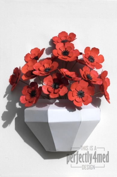
I’ve taken a bit of time out from designing for my college course to make this canvas featuring a paper craft vase and paper craft, die cut, hand coloured and constructed flowers. I’ll be entering it into Tim Holtz’s Tattered Floral Challenge as it is his Tattered Floral die that I used to cut the flowers from 160gsm thin card. The vase is made from the same card to my own design – SVG file available if anyone would like it…

Each flower layer was wrinkle free distressed in first a layer of Fired Brick and Festive Berries both sides, dried and then wrinkle free distressed in a layer of Fired Brick with Ripe Persimmon. They were then dried before being spritzed and flicked with water and left to dry naturally. The centres were punched and then sprayed with Dylusions Granite spray. The flowers were assembled onto florists wire and stuck together with matt multi medium and left to dry over night before being glued into the vase and onto the canvas background.

IMG_1167_w

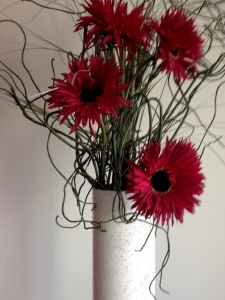
Here’s the inspiration pic, a vase of flowers in our lounge:

IMG_3472

Tulip Cards

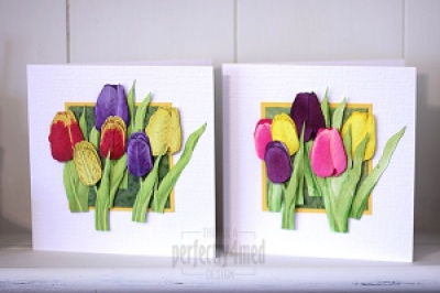
I’m on another design team! Early in January I was selected to design for ‘The Crafting Cafe’, and they have just launched their challenge blog. For the ‘anything goes’ theme this month, I’ve used the fabulous ‘Tulips 1’ digi stamp from LEJ Designs. I’ve created two cards, the first using ProMarkers to colour, and the second with Distress Reinkers both on a bespoke background created with Distress Stain and kitchen salt:

Continue reading

Warm Wishes – Kraft & Kreme

I’ve been asked to do a guest slot on the Less is More blog today 🙂

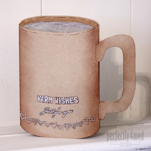
This week’s theme is Kraft & Kreme, and as always, a clean and simple design is required. Ok, my design might not be so simple to make, but it’s clean and simple under the definition of lots of white space (i.e. unfilled – kraft card isn’t exactly white!).

WOW Feb 2013


I cut a 15cm sq kraft card to shape, keeping the oval offcut from the front. I made a mix of 50:50 WOW! Primary Bark with WOW! Vanilla and triple embossed onto the oval offcut, then whilst still hot swirled it with a metal tool. I used the same mixture to emboss the sentiments (from WOW! Merry & Bright Christmas and WOW! Everyday Sentiments) and hearts (from WOW! Gratitude) – I flexed the clear stamps on the acrylic plate to follow the curve of the card. I outlined with Vintage Photo Distress Marker and shaded with Vintage Photo Distress Ink. I’m happy to create a template if anyone requires one 🙂

Twelve Tags of 2012 – December

It’s the last Craft Club of the year tomorrow, and thus the last of my twelve tags of 2012. This one incorporates WOW! Embossing Powder, die cut tattered pine cone, a cocktail stick, hot glue, dry glitter and the special secret ingredient – an upcycled orange juice carton! There will be the option to add holly sprigs as well.