The Less is More challenges are back from their Christmas/New Year break! The first this year is a one-layer card challenge – the image must be printed or stamped directly onto the card blank, with no additional layers and no embellishments. The theme is open – anything goes. Here’s my abstract design team card for your inspiration:
Tag Archives: LIM challenge
LIM: More than one type of foliage
It’s recipe time at Less is More and the theme chosen is ‘more than one type of foliage’. One of the main aims of the challenge (aside from making sure the card is clean and simple) is to make the theme to be the focus of the card. There was only one stamp set I could think of in my collection that would fit the bill – a set of five fern fronds by Hero Arts. Here’s the eventual winner, from three I made, for my design team card:
Colouring the way nature intended…
Challenge time again over at the ‘Less is More’ blog, and this week it’s the colour theme: they’ve used this fabulous picture from Design Seeds to define the colour scheme –
I decided to colour match the swatches using Versacolor small inkpads and came up with the following colours: Cement, Bisque, Khaki, Charcoal and Umber. They are close matches – as always with colour matching, each monitor, printer and eye is different resulting in all sorts of different interpretations. I also noted that the wet inks are significantly different to the dry…
But here’s my challenge entry – one of my favourite stamps (from Hero Arts I think) along with the label and sentiment from Tim Holtz/Stampers Anonymous:
I inked all over with the Umber, before removing ink over the various plant parts using a tissue or wet wipe. I then carefully inked in with the other colours – the small ink pads come in handy. It would have been a one layer card, except I didn’t notice the first impression of the label had a filled in centre… overzealous inking with a new pad!
Update: 16-Aug-13
This card was chosen as one of the showcase ‘winners’ on the challenge blog 🙂
Papercrafted Clematis Card
As I type, my head is pounding, my ears are popping, and the light-sensitive lights are on and it’s only 11:25am. Something to do with the English heatwave breaking down – there’s thunder and lightning and I love it!
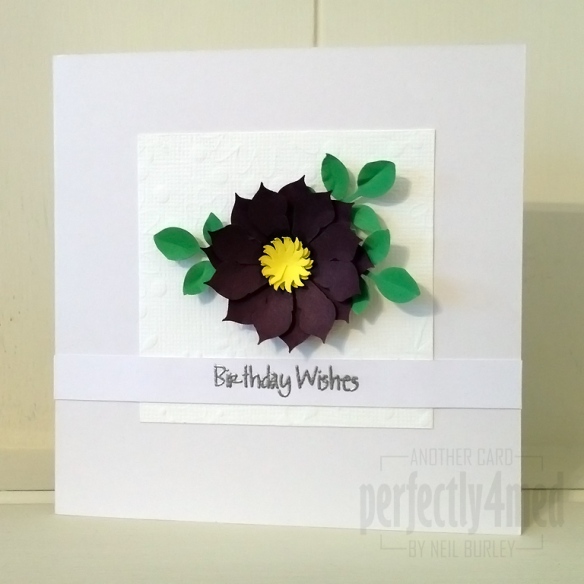
Another challenge stimulated a spurt of creativity this morning – it’s another for the ‘Less is More’ blog, and this week it’s ‘hand made flowers’. This card features my handcrafted clematis flower, using the Leone-em bumble bee paper punch to create the petals and an ash leaf punch for the leaves, shaped with an embossing tool pressing into funky foam. The centre is a sun punch, with a smidge of Aubergine ProMarker underneath to darken the centre and similarly shaped. A quick mount on Bazzill pre-embossed cardstock, and a strip of thick white card with the sentiment from WOW! Everday Sentiments clear stamp set embossed with WOW! Metallic Silver embossing powder.
I’m in the process of planning a ‘Papercrafted Flowers’ workshop at my studio in Leicester – if you’re interested, let me know below and I’ll keep you informed 🙂
Playing with ProMarkers
It’s been quite a while since I had chance to enter any web challenges, and since planning workshops is going fairly well, I decided to use time today to put that right. I’ve got out my ProMarkers again, and created two cards:
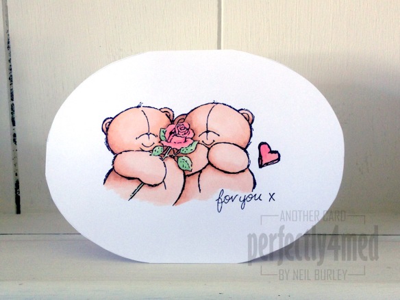 The first is for the ‘Less is More’ one layer challenge this week, which requires that I use a ‘not square or rectangular’ card. I used string theory to draw out an ellipse template and transferred this to a card made from my favourite white coated cardstock (from Rymans) before stamping the image [docrafts] using Memento Tuxedo Black. I coloured the bears with Blush, Saffron, Ginger and Cinnamon, with Meadow Green/Apple and Pastel Pink/Salmon Pink for the roses.
 The second is for the ‘Passion for ProMarkers’ weekly challenge, which this time set the task of ‘set the scene’. I stamped the background image [Hobby Art – Countryside Scene] in Archival Jet Black onto watercolour paper before using AquaMarkers in Frost Blue/Perwinkle, Celery/Spring Green/Fern Green and Viridian with Granite and a waterbrush pen to colour. The picnic blanket was drawn freehand and coloured with ProMarkers – Warm Greys 1-4 over Lipstick Red. The girl is a stamp from Bild Malarna ‘Mimosa – Wonderful Day’ and complements the scene beautifully – she is stamped with Memento Tuxedo Black and coloured with ProMarkers: Pastel Yellow/ Sunflower/Gold and Caramel and Lavender/Orchid/Amethyst and skin tones blending Blush/Oatmeal and Apricot.
Warm Wishes – Kraft & Kreme
I’ve been asked to do a guest slot on the Less is More blog today 🙂
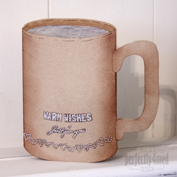
This week’s theme is Kraft & Kreme, and as always, a clean and simple design is required. Ok, my design might not be so simple to make, but it’s clean and simple under the definition of lots of white space (i.e. unfilled – kraft card isn’t exactly white!).
I cut a 15cm sq kraft card to shape, keeping the oval offcut from the front. I made a mix of 50:50 WOW! Primary Bark with WOW! Vanilla and triple embossed onto the oval offcut, then whilst still hot swirled it with a metal tool. I used the same mixture to emboss the sentiments (from WOW! Merry & Bright Christmas and WOW! Everyday Sentiments) and hearts (from WOW! Gratitude) – I flexed the clear stamps on the acrylic plate to follow the curve of the card. I outlined with Vintage Photo Distress Marker and shaded with Vintage Photo Distress Ink. I’m happy to create a template if anyone requires one 🙂
Brown & Pink Inverse Cards
Well I don’t think these will win any prizes! They are a quick and somewhat crude card, using punches and Bazzill card stock. What’s punched out of one, fits into the other. The colour strips were added on top, and the sentiment is cut using the Cricut Opposites Attract cartridge. I made them for a quick entry to the Less is More challenge, and I think they show I’m a little out of practice!
Take three stamps…
Take three stamps, add a little bit of colour magic and hey presto, another challenge entry! Well two, I couldn’t make up my mind which I liked best… It’s one layer week at ‘Less is More’ and the stipulation was to use three stamps, not two, not four, three. There’s precise for you!
 Hero Arts Long Writing Background (F2674) in Frayed Burlap DI
Impression Obsession Textured Evening Gown (D4320) in Sepia Archival
Sentiment from WOW! Everyday Sentiments Clear Stamp Set in Jet Black Archival
-=-
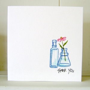
Inkadinkadoo Arrange A Bottle Cling Set
WOW! Everyday Sentiments Clear Stamp Set stamped in Jet Black Archival
Bottles: Manganese Blue Archival, shading with Tumbled Glass Distress Marker
Flower: Tea Dye, Walnut Stain, Peeled Paint and Worn Lipstick Distress Markers
Yellow Flowers and a White Frame
It’s ‘Less is More’ challenge entry time again, and this week, being the first in the month, it’s a colour theme: yellow. I had in mind for last week’s sketch challenge to do a frame with 3D flowers in, but didn’t end up having enough time to make it. So here’s the same plan, with yellow flowers!
Three Shades of Green with a drop of yellow
It’s ‘Less is More’ challenge time again – and this week I’m a little earlier than I have been for the last couple of times! The first week of the month theme is colour, and they’ve set the task of creating a clean and simple card with three shades of green. I used the Hero Arts ferns set of stamps, and Shabby Shutters, Peeled Paint and Forest Moss Distress Inks. A spritz of water, punched flowers and a few drops of liquid pearls and here’s my entry:


