AAA Cards DT: One Inchie

At the end of the summer, I was delighted to be invited to join the AAA Cards design team. AAA Cards is another clean and simple card challenge blog with a twice-monthly theme. All entries have a chance to win a ‘guest designer’ spot in a future challenge.

As a newbie DT member, I will start officially in January but feature in this week’s challenge as an introductory offer. The theme is ‘one inchie’ with the optional twist of making a card suitable for a man/boy. For those not in the know, an inchie is a piece of work that is either 1″ square or diameter. An added challenge is the requirement that all the artwork, sentiment, and matting must be within the prescribed one inch. There is an option for the inchie to be an aperture as a window to artwork inside.

An inch is not a lot of space and few, if any, of my stamps/die cuts/sentiments would fit. So, I thought laterally and rummaged through my stash until I found my shrink plastic. If the stamp is too big, shrink it!

Continue reading

Altered Art: Transparent ATC [Pick A Stick Challenge]

ATC

A recent craft magazine article showed some Artist Trading Cards (ATCs, 2½” x 3½”) made of clear acrylic sheet. By decorating the front and back, there was depth added to the whole image. I loved the idea, so got hold of some pre-cut acrylic ATCs from That’s Crafty. All being well, I’ll be cutting my own soon enough on one of my aforementioned machines.

Anyhoo, the makers of the Pick A Stick Challenge FB group (for art journalers) have come up with a new challenge – the Pick A Stick ATC Challenge. Instead of ten prompts, ATC Challenge has just three, but they still have to be done in order. This month, the steps are:

  1. Use ink
  2. Add tissue tape or masking tape
  3. Use something transparent

What a chance to use a transparent ATC! But that was the last step… what to do? Work out a new technique of course! Continue reading

Mop-up Tags

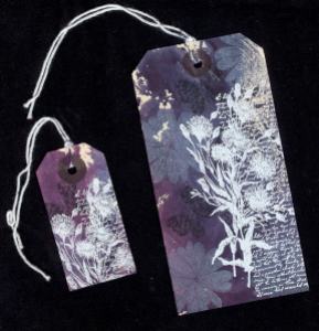
Two decorated luggage tags

These two tags were part of a batch that I put together yesterday morning. I’d done the background colouring some time ago, dragging the tags through some dye overspray (mopping up) after I’d been colouring a cotton apron [Adirondack Color Wash: denim, cranberry and wild plum]. They’d sat on my desk for a while before I came up with the finishing touches: the flower is an Anita’s stamp inked with Stazon Opaque White, and the Laura Ashley [Dovecraft] butterfly and branch were stamped with Memento Tuxedo Black ink. These add layer and depth and form a lovely background for the white heat-embossed Penny Black letters and flowers [4035K] stamp. I used some as give aways and the rest I think will adorn cards or my art journal. Or possibly even some greeting cards.

Embossed Metal Journal Faceplate

20110404-020220.jpg

I finished this faceplate for my art journal this afternoon – I started it last night. The motif is an unmounted stamp from Paper Artsy, stamped onto copper side of Ten Seconds Studio’s double-sided metal foil using Stazon Black ink. I then used metal embossing tools to give the image some relief. The text was laid out in word processor before being printed out and traced through onto the metal. I then embossed the text. The embossed areas were filled with Ranger’s Glossy Accents before sticking the whole plate onto thick card with a smear of Glossy Accents over the flat surfaces. I let the plate dry overnight. Filling the raised areas with Glossy Accents stops them denting through wear at a later date as it dries to a structural solid – larger areas can be filled with lightweight DIY filler instead. The aging was a bit hit and miss, using black acrylic paint, a sanding block and lots of  restarts. I also used Stazon Stamp Cleaner to remove the stamped outline. It’s stuck onto the Moleskine art journal with extra strong double-sided tape.

Glossy Background Variations

This is this month’s project for a card crafting workshop afternoon I teach on the third Saturday of each month in Leicester, UK. See my ‘about me’ page for more details.

Distress ink was applied to an A4 sheet of glossy card using a brayer: broken china, dusty concord and worn lipstick. I then cut the sheet into quarters and left one quarter as was [flowers]. The second quarter I sprayed with water and allowed to dry, giving a speckled bleached look [butterflies]. The third quarter I wiped some of the ink off with a baby wipe, before using a scrunched up vinyl glove to apply the same colour inks from the pad to the card to get a wrinkled look on a bleached out background [lily/gems]. The final piece was dabbed with a scrunched up moist baby wipe, again producing a bleached effect [tree]. Each piece was cut in half again (ie eight pieces from one A4 sheet). Images were stamped on with either black or opaque white Stazon ink, and matted onto bazzill cardstock. The tree foliage in this example was added after stamping the tree silhouette by dabbing ink on using the scrunched up vinyl glove (a scrunched up plastic bag or cling film would work as well). The gems on this occasion are dabs of Stickles glue in coordinating colours – but hotfix rhinestones or self-adhesive gems would work far better.