I’ve been asked to review the basic tool set from Cricut. There are five tools designed for use with the Cricut machines and cutting mats: spatula, weeder, scraper, scissors, and tweezers. All of the tools have end pieces suitable for hanging and any metal components are well attached to the plastic handles. I’m going to look at each, in turn, discussing their use(s), before giving my overall impression.
Tag Archives: review
Review: The Paperbox card and paper, part II
A little while ago I reviewed a box of goodies from The Paperbox Ltd. Today, I continue the review showing a few makes along with some notes.
Review: Digital Art Journaling
Well, it’s a strange world at the moment. I’m not in self-isolation, but I, like many other self-employed freelance workers, am finding things a wee bit quiet at the moment. So, I’ve been flicking through some art journaling magazines and came across a course I thought looked great. It’s ‘Digital Art Journaling’ from Jessica Sprague and despite it being published a couple of years ago, is still available. Here is a flick through of the finished journal and after, a quick review which I hope you find useful.
Review: The Paperbox
I’ve just received a sample box of paper and card from The Paperbox Ltd after they asked me to review them. Here’s my initial review (will do ‘in use’ reviews in future posts):
Continue reading
When I met… Ken Oliver
This is a shockingly late, shameless promotion for all that is Ken Oliver. We’ve been Facebook buddies [like him here] for a little while (after all there aren’t that many gentleman crafters at shows and we need to stick together), and I have had the pleasure of saying hi a couple of times in person at trade shows. This February he was here in the UK promoting his new ‘own brand’ crafting goodies, and he was kind enough to do the whole selfie thing with me, demonstrate his new Color Burst watercolours and give me a promo pack of 12×12″ Studio series of papers and a 6×6″ sampler pack of his other papers.
I thought I’d use the 4×6″ journal cards sheet from his Studio collection to start off my new Project Life scrapbook, and they worked perfectly. The papers are printed on a satin finish light cardstock which feels smooth to the touch. There’s no bleed through from the Sharpies I used for some of the handwritten text, which is a bonus when working on double sided papers. As one might expect from an artist that’s been in the trade for years, the designs and colours used all work together beautifully. One slight hitch I noted when gluing things down – the satin finish does resist water-based liquids a little, as I found when I was using Zig Memory Systems two way acrylic glue. Something to be aware of, though that didn’t turn out to be too restrictive in practice – it might be more of an issue if spritzing with water/Color Burst (something I’ll test out).
Ken was also demonstrating his Color Burst watercolours. These are fine crystalline colours, conveniently dispensed from fine nozzle bottles. They appear to be similar to Brusho crystals (becoming very popular in the UK) in their reaction with water, both to make a watercolour paint, and in spritzing on the page to make vivid backgrounds. Where Color Burst beats Brusho, in my opinion, is the finer, more even crystal size and the fine nozzle capped bottle. I’ve knocked over a holed Brusho pot into my distress ink pad storage box, and the turquoise crystals continue to find their way into projects, much to the annoyance of my Tuesday night ladies… The reverse of my Project Life page shows a couple of samples from Ken’s beautiful Watercolored Memories 6×6″ papers (top left, bottom right), and the rest are Ken’s own demo sheets showing the vivid colours and dynamic reactions of the crystals with water on watercolour paper.
Thanks to Ken for having a chat, demoing his fabulous products, and especially for the goodie pack. Sorry it’s taken me so long to fulfil my promise to post about our chat!
Chameleons on Noah’s Ark: trialling the latest alcohol markers
 The image I’ve used is a digistamp from The Stamping Boutique sponsors for this month’s Crafting Cafe challenge – check their blog later in the month to see the card I make with it.
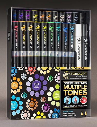
But the purpose of the colouring in was to trial and review the deluxe set of Chameleon Pens I recently purchased. There have been a fair number of reviews online, both good and bad, and a fair number of my Facebook friends had indicated they hadn’t got on with them at all and had returned them. I watched all the available videos I could find, as well as the shows on Create & Craft, found a good offer and went for the full set.
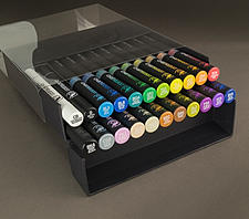
For the uninitiated, the pens are a basic dual tip alcohol ink pen – there is a bullet point and a brush-like nib. In addition is a reservoir of the solvent attached to each pen with its own brush nib. In use, you put coloured tip to solvent tip, keep solvent on top and the pen upright for a defined period, and then start colouring – the solvent dilutes the colour, resulting in a tint which develops the fuller colour as the ink flows back into the nib. Thus from one pen, you can get all the shades. The ink on the page is also translucent, and along with other alcohol ink pens, blends whilst wet and overlays once dried. The deluxe pen set includes all 20 colours, a blending pen and a detail black pen, along with some spare nibs and an instruction sheet. They are in a handy holder which also presents the pens for use when open.
For my full review, read on… but in the meantime here’s the executive summary. I think in terms of colour intensity, blending, bleed and application, these pens are pretty much like-for-like alongside Letraset’s ProMarkers. Their USP is the many shades, one pen however:
PROS> no swapping pens constantly, no need for several pens or layers to shade light to dark, mix time allows for planning next area (i.e. time isn’t wasted). CONS>Getting large areas the same shade is very difficult unless keeping to undiluted pen colour; may need to use a different colouring method.
CONCLUSION: These are a great addition to my alcohol pens, and best suited to detailed images needing obvious shading. I’d not recommend them for large areas of same shade colouring – I’d stick with several ProMarkers. I certainly don’t regret buying them and definitely won’t be sending them back!
Crackle Effect Mediums – putting them to the test
I love a decent crackle effect, but it’s a notoriously difficult thing to get ‘right’ and nigh on impossible to get the same results every time. I noticed I have collected a number of different crackle effect mediums over time and thought it was time to do a side by side trial.
Letraset Neon Markers – review
I’ve just received a complimentary set of the new Letraset Neon Markers (6 set), on sale from 1st September 2012. According to the information sent with them, they are twin tip fluorescent markers offering water-based pigment ink which is lightfast and ‘perfect for adding vibrant highlights to art and design work’.
I decided to put them through their paces. Firstly – colour on white, and then because they are pigment inks, on black too, and across text:
Allowing for poor colour reproduction of fluorescents, the colours are what you’d expect to see on white – vibrant and in your face. The ‘spark red’ isn’t all that sparky, but I guess it joined in to make the six pack… On the black, there’s going to be a colour shift, and I put three layers of ink on each of the blocks to get enough pigment on to show up – all but the ‘Luminous Yellow’ have good coverage, and may well have a role to play on dark backgrounds. They clearly work well as regular highlighter pens.
Do they blend? I love to use Letraset ProMarkers as they blend so well together. The AquaMarkers also blend and merge nicely. So I put the new Neon markers to the test, and since they are water-based, I used them on a good quality watercolour paper:
Well, I’m not so impressed. Direct blending from the pen didn’t really happen – it rucked up the paper, and the colours tended to keep distinct from one another. Adding water caused the crossover to become blotchy and granulated. Washing out with a wet brush was slightly better, but the colours behaved differently, some moving readily, others less so.
I can’t see these markers making their way into my artwork – I don’t think they have the flexibility of use I enjoy from the ProMarkers or AquaMarkers, and I already have highlighter pens around the house that do the same job. I think Letraset have missed a trick here – the Neon Markers don’t seem to be either ProMarkers or AquaMarkers and that’s a pity.
Martha Stewart Craft Paints on Ceramic/Glass
I had an ‘interesting’ day yesterday at the fantastic Coleman’s Craft Warehouse Big Demo Day. I was billed to do a make and take with the Martha Stewart Craft Paints on Ceramics, but there was an unexpected influx of young children which resulted in me being asked to lead a children’s party next week! (I declined!)
That said, I’d done plenty of preparation for the make and take and here are pics of my samples. The plates are technique samplers and the text is written with a porcelain marker. All of the samples were baked, and are dishwasher safe – I actually tested this claim before I agreed to promote the paints, and I can absolutely say it does what it says it will do! The paints are more adherent than most acrylics I’ve used, and though water based, the box says not to mix with water – I presume this messes about with the resin technology that makes them multi-surface. You can thin the colour with the glaze product that is in the same range of products, which is how I managed to get the wood grain effect on one of the mugs using a brush. I would recommend applying the paint with a sponge onto non-porous surfaces and you can use a heat gun to make a layer workable, although it is not as stable as if left for an hour or so to dry between coats. The frosted glass effect paint is also applied with a sponge and is one of the most user-friendly frostings I’ve ever come across.
The paint itself is a creamy consistency, dabs on well and has good opacity. It comes in four varieties – a Satin Finish which seems more matte to me, a pearlescent – which is striking, a glitter – which is more of a coloured glitter translucent glaze, and a high gloss. The colour range available is comprehensive and there are various special effect bottles that I haven’t had the opportunity to play with.
I’m particularly impressed with the range of accompanying accessories, including the fine applicator tip that attaches to the bottle (see the high gloss black outlining) and the sponge dabber tips that do the same. Ms Stewart has also included an empty bottle in the pack which is for rinsing out the caps when done with clean water. Clean up is easy – as long as you do it while the paint is still damp. The paint by its nature sticks firmly and to any surface. I found that the stencils retained paint even after cleaning quickly after use, but any dried paint didn’t shift with subsequent applications.
To be honest, I’d probably use other acrylics for painting porous surfaces, but I’d certainly recommend these craft paints for any non-porous surface.
Letraset Ultrafine Tip for ProMarker – review
Hi all 🙂
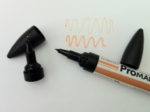
I’ve been lucky enough to get my hands on a few of the new ultrafine tips for ProMakers (thank you Michelle at Letraset), and here’s my review!


