Summer of Creative Chemistry: Week 2

I’ve snatched some ‘me’ time in the studio today and revisited some of the lessons on distress stains and markers from Creative Chemistry 101 – a staggering four years ago! It’s part of the Summer of Creative Chemistry from onlinecardclasses.com, in the lead up to the brand new Creative Chemistry 103 from Tim Holtz. These are three tags created for Week 2.

Continue reading

Background Check: Day 1

BC_participantI’m taking part in Online Card Classes’ Background Check, and it’s Day 1, and time to get inky! Some of the techniques aren’t new to me, but a couple are, and a great addition to my mixed media arsenal. Here are the highlights of this afternoon’s play:

I have to admit the cloud on the sunset was a happy accident – my not so low-tack tape happened to tear off my carefully blended area, so a little more ink and a cloud was born! The metallic like sheen on the purple image is also accidental – the Hero Art Ombré pads do seem to have an unpredictable effect when used direct to paper.

Continue reading

Distress Products Storage

IMG_6244_wWith all the new colours coming monthly from Tim Holtz/Ranger Industries, my existing system of Distress products storage (5 litre Really Useful Boxes for the stains/paints, 9 litre for the sprays) was no longer large enough. After a little research, I’ve moved them into a 33 litre Really Useful Box – and even that isn’t big enough… I think I’ll need a second. I’ve arranged them as shown so that I have a ready reckoner when taking my kit to classes where occasionally one or two bottles accidentally end up packed away elsewhere – this way I can quickly do a stock check and pin down what’s missing. The browns and speciality colours are currently in a 9 litre box until I can get hold of another 33 litre one, which I’ll also add the ink pads to fill up the free space. Now all I need to do is find somewhere to keep this box…

Continue reading

Sandy Toes Beach Hut Clock (for Jones Crafts)

IMG_5571_w

This month I have the gorgeously summery ‘Sandy Toes’ collection from Kaisercraft to play with. I also got sent a Candy Box Crafts Bird Box Clock Kit to work with… So I combined them both to make this beach hut themed clock.

Continue reading

Crackle Effect Mediums – putting them to the test

EffektCrocoDistressPVAAleene'sCrackle Accents
GoldenVallejoDecoArt2StepVecchi

I love a decent crackle effect, but it’s a notoriously difficult thing to get ‘right’ and nigh on impossible to get the same results every time. I noticed I have collected a number of different crackle effect mediums over time and thought it was time to do a side by side trial.

Continue reading

Family Circle 1901

This is my final project as a member of the WOW! Embossing Powder Design Team. This family project published today, here, features my great great grandfather and his eight children. I’m in a black and white phase at the minute, and wondered if the whole frame looked a little funereal, but then others have said it’s quite gothic and in keeping with the end of the Victorian era. I’ll go with that 😉

Mixed media cards

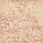
It’s demo time again for the Manic Stamper Craft Club, and I’ve spent the last four sessions teaching various techniques, including distress inks, image transfer, acrylic paints and myriad other art materials. There was a request that we take time out this month to put the techniques into practice, so I’ve spent a while in the studio coming up with these three cards:

The bath time one features image transfer, distress inks, and faux rusted enamel technique. The flowers use acrylic paints for background, stamping, tinting and covering metal embellishments. The final card uses the Ranger Summer Palette Challenge colours in distress inks, stains and alcohol inks as well as a bit of shine from Perfect Pearls, trying the capture the long car journeys for our summer holidays! Hopefully they’ll be enthusiastically received as examples of mixed media chemistry 🙂

Quick mixed media tags

I’ve got into the studio at last to do my own thing in between some craft room reconfiguration and college work! I’ve chosen to do some quick mixed media tags using mainly Ranger/Tim Holtz products:

Continue reading

Drypoint print – the gallery editions

As I mentioned in my original post, I planned to further work on my drypoint prints, adding tone and colour. Here is a gallery of the results – and the bottom right is the print I have given away, number 13 of 15 – and may be the winner will want colour added? Most of these are now mounted for the end of term exhibition. There are some other prints available to purchase if you’d be interested…

I think some work better than others – I’m not happy with the tea dye one, it’s too dark. I am happy with the greyscale/monotone trees with the colour window. The pastel is very much in keeping with Jacek Yerka’s work on which this is loosely based as he prepares his paintings with a pastel version first. Let me know what you think 🙂

Creative Chemistry 101 – Day 5

I’m still catching up with my CC101 homework – today I’m publishing Day 5 on Day 7 🙂

Day 5 was all about playing with Distress Stains – the first tag showing their effects on kraft resist with distress inks over and stamped with jet black archival ink. The second builds up the colours on a wet tag with distress stains before drying off and overprinting with Picket Fence Distress Stain applied to a stamp and dried off quickly before overstamping with archival black. Finally is my attempt (the first one) at doing the distress stain marbling using the Picket Fence Distress Stain – it turned out ok, but I think I’ll have to try different colours and surfaces to get a more marbled effect.