Art Journal Page: Alphabet Sampler

IMG_6414_

There seems to be one common theme amongst those attending my art journaling session each month – they don’t like their own handwriting. Or don’t think they can do hand lettering on their pages. Well, they’re in for a shock in September’s session… this is the project! Starting on an acrylic paint background (it wipes clean!) I’ve gridded off the page, free-drawn my letters and then gone mad with the paint and black and white pens. It’s an exercise in drawing and embellishing, and hopefully will give my class a little more confidence to do their own thing on their pages. Or put them off completely. I’ll let you know.

Continue reading

Art Journal Page: What’s in a word?

IMG_6274For those that don’t know, I have recurrent depression, with relatively frequent episodes of lows and pretty good recovery in between. You may correctly guess I’m struggling at the moment, based on my art journal reflections today (which are based on my ruminations in the shower this morning). Now, I don’t normally share autobiographical stuff, but the topic of depression is being discussed elsewhere in the crafting world and I felt moved to share my own experiences of this mental (absence of) health issue – the more we talk about mental illness, the less threatening it might be for someone else.

What’s in a word? Recurrent – it’s a cruel word. You don’t hear of people being recurrently happy. Or recurrent joy. Those too can be ‘unending’ but recurrent has it’s root in the Latin to ‘turn back’. And with recurrent depression, it’s like that – only a passive result of chemicals misbehaving rather than a conscious turning from ‘health’. It’s especially cruel, I think, as recovery between makes the downs even more difficult to deal with. Though medication is helping, and next week I’m going to be discussing throwing a mood stabiliser into the mix as well, there’s not a lot I can do to stop an episode occurring. Or recurring. Resilience disappears out of the window in the middle of an episode, and everything is an effort. I am lucky enough to be aware enough not to curl up in a ball, and capable enough to at least do some of my normal activities – even if they take up twice as much time and energy as they otherwise would. I am lucky enough to still have hope – I know at some point the bleakness will lift. It’s the not knowing exactly when, or how long for that’s the killer. And on that topic, I’m also blessed not to have suicidal thoughts or ideas that often accompany depression – but I so understand where they come from. I am supported by an extremely understanding wife and a close group of church friends, and indeed customers, who cope with me whatever state I happen to be in – and that’s worth keeping going for.

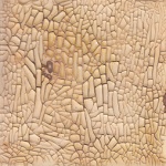
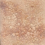
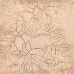
Back to business: background is acrylic paints in teal/brown/black – I think they were part brayered on, part swiped. Main word is stamped in Hickory Smoke Distress Paint. Rest of text in Sharpies.

Continue reading

Art Journal Page: One Voice

IMG_6265_wI promise this is the last page (for now) with the wooden block prints – just in case you’re getting bored… I’ve got enough done now to demonstrate what can be done with them at my Art Journal Session at the beginning of August. This one is a little more of a creative statement highlighting the quotation – I love how the Walnut Stain Distress Ink rubbed over the collaged speech bubbles has made them look grubby as well as making them recede into the background. Enough said, I think.

Continue reading

Art Journaling – Inverse Silhouettes (2)

We had fun last night with inverse silhouettes at my Art Journaling Session here at The Studio. There was a little bit of apprehension at painting over a perfectly good background, and then ooohs and ahhhs as the colours started to zing against the black. Here’s another  of my examples from last night:


ArtDaisies_w


I think the background is Distress Paint using the spritz and splat method on a non-stick craft sheet. The white is brushed acrylic ink, with Signo broad white pigment pen over the top, and the yellow centres and daisy shadows are Sharpies. I’ve also added a bit of shading at the top of the circles to suggest a drop shadow under the black layer with a water-soluble black pencil smudged out with a water brush.

I was also reminded of several other pieces I did back in 2013 using a similar technique – the post is here.

Continue reading

ZIA on other surfaces: monoprinting

Monoprint_w

I’ve just taken delivery of my 3×5″ Gelli Arts Plate, which is the perfect size to have a go at a technique I wanted to test for my forthcoming Zentangle Inspired Art workshop. I mixed black acrylic with a slow medium in equal quantities and used a brayer to cover the plate evenly with the black paint. Working as quickly as I could, I scraped paint off with a rubber tipped tool to ‘etch’ the tangle design. Despite the speed at which I worked, the acrylic still dried, so by the end I was scraping into dried paint, and to transfer the monoprint to paper I needed to add a layer of matt multi medium over the dried paint. After everything had dried on the page, I added Distress Inks to colour. A fast and furious sample, but a technique I think I will try again, perhaps with Golden Open acrylics or even a waterbased printing ink.

Have a go at this technique, along with others, at my workshop on Easter Saturday.

On a separate note, it is worth having a look at my original image – which was taken with a camera – the gloss finished of the acrylic played havoc with the light… Whereas the scanned image above shows off the piece far better. There’s also some resist happening with the black and the multi-medium which adds to the texture.

IMG_5715_w

Continue reading

The grass is always greener…

IMG_5516_wAnother art journal page, completed as my homework for the art journaling sessions I run in The Studio on the first Monday evening of the month.

This month we learnt the technique of image transfer, and I set the homework of using image transfer in a layout. For this piece, I took a background image of the grass, printed it twice at full sheet A4 size on a laser printer and then used matte multi-medium to transfer each sheet to one side of a double spread previously covered in green/turquoise acrylic paint. The acrylic background is helpful in case (as here) the image transfer doesn’t take across the whole page, as well as not moving about with the multi-medium gel.

Once I’d done the transfer, I printed the text using matte white acrylic paint on rubber and foam stamps, and outlined them with a white Signo broad pen once they were dry. Finally, I went round some of the letters with a green coloured pencil to help darken the lighter grass colours to improve the contrast of the letters against the background. Oh, and the pink hue on some of the letters comes from previous inks used on the foam stamps staining the white paint!


Love is… tarmacing

Love WordIt’s a lurve theme over at The Crafting Cafe this month, and the DT got to work with digistamps from the fabulous Bugaboo Stamps. Ava and Deacon’s Love Word was perfect inspiration for this 12×12″ canvas board layout. I coloured the image with ProMarkers and the board with acrylic paints and added my new favourite tarmac technique. For a bit more detail, see my post at The Crafting Cafe.


Sewing Room Door Plaque (for Creative Expressions)

Sewing Room Door PlaqueAnother of my projects featuring Creative Expressions’ Antique Dressform stamp set. This one is sporting a few embellishments that I wouldn’t consider to be my normal style, but the ribbon roses (also from CE) matched the theme perfectly and made a great pin cushion for the various pins I nicked from my quilting stash. No step-by-step photos this week, but there’s still a kit list and instructions for those that want them:

Continue reading

Crackle Effect Mediums – putting them to the test

EffektCrocoDistressPVAAleene'sCrackle Accents
GoldenVallejoDecoArt2StepVecchi

I love a decent crackle effect, but it’s a notoriously difficult thing to get ‘right’ and nigh on impossible to get the same results every time. I noticed I have collected a number of different crackle effect mediums over time and thought it was time to do a side by side trial.

Continue reading

Mixed media cards

It’s demo time again for the Manic Stamper Craft Club, and I’ve spent the last four sessions teaching various techniques, including distress inks, image transfer, acrylic paints and myriad other art materials. There was a request that we take time out this month to put the techniques into practice, so I’ve spent a while in the studio coming up with these three cards:

The bath time one features image transfer, distress inks, and faux rusted enamel technique. The flowers use acrylic paints for background, stamping, tinting and covering metal embellishments. The final card uses the Ranger Summer Palette Challenge colours in distress inks, stains and alcohol inks as well as a bit of shine from Perfect Pearls, trying the capture the long car journeys for our summer holidays! Hopefully they’ll be enthusiastically received as examples of mixed media chemistry 🙂