LIM DT: Autumnal one layer card

One Layer Cards (OLCs) are often the trickiest of the Less is More challenges. All the elements must be directly on the cardstock used for the card itself. No die cuts, matting layers, or indeed most embellishments are allowed. The card itself must retain the clean and simple rule as well. This week’s theme is ‘autumnal’ and I’ve used a previous art journal page as inspiration for my card, which I think would be suitable for a sympathy card.

Continue reading

Art Journal Page: Scratch ‘n’ scrape

It’s lovely to have restarted my art journaling sessions here at the Studio (first and third Monday evenings of the month). This means that I have also returned to my art journal after a several-month hiatus to create the sample pages for the session. This month the theme is scratch ‘n’ scrape, in part known in the trade as sgraffito. We’ll also be playing with analogous and complementary colours. The overall effect is quite grungy and builds up using quite a few layers and media.

If you’d like to know more then I have one space left on Monday 4th October and four spaces on Monday 18th October, just let me know if you’d like to come.

Art Journaling – Inverse Silhouettes

Those of you who happen to lead projects or workshops, or lessons, or sermons, may have the same reaction as me to the question ‘what are we doing next time?’. There’s the moment of panic – ‘I’ve not even thought about it’; then there’s the moment of ‘shall I make something up?’. Then there’s the next thought: ‘I really must get a lesson plan together’. All of which then gets summarised into the quintessential reply: ‘It’s a surprise.’

So it was at the end of my last art journaling session a month ago. Since then, a little planning has happened, and I’ve come up with the project for Monday’s session: inverse silhouettes. Here’s a couple of examples I’ve done this week:

IMG_5786_w IMG_5787_w


And it’s perhaps no surprise to learn that I’ll probably have the same answer at the end of that session…

Continue reading

Happy Days Are Here (for Creative Expressions)

NB-140820

These floral panels from Creative Expressions are so useful for making cards full of colour and the included sentiments give flexibility in how you can use the cards you make. This week I’ve included two summery panels, with a sentiment designed to remind me in the depths of winter murk of these glorious days of sunshine!

Continue reading

Mother’s Day Garden Card (for Creative Expressions)

Mother's Day Garden Card

While I’m working on next week’s 3D piece, I thought I’d just do a quick Mother’s Day card using the Floral Background stamp from Creative Expressions again. I sort of hoped it would remind the viewer of a woodland walk, so used their fabulous Bark embossing folder as well. Bit of grungy rust-effect as well and the look was complete 🙂

You can download a worksheet here, or read on for making instructions…

Continue reading

Arts in Worship

I’ve recently joined a new worship group at the church I’ve been going to since December 2012, Whetstone Baptist Church. As there are two of us trained to work the data projector, I was at a loose end a couple of Sundays ago, and thought I’d do some art work during the service. I’d had a couple of sheets of pre-coloured watercolour paper left over from a craft club, so took one of those, a permanent black marker, a white Signo pen and drew this during the services:

Beautiful One

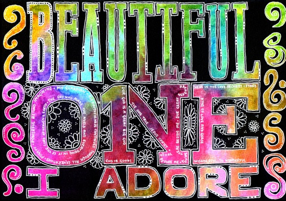
Inspired by words of one of the songs, and adding other lyrics and phrases from the sermon made this a specific act of visual worship for that service.

Encouraged by the response to this, I was then asked to do some more artwork to complement a service last Sunday where the plans for a new church building were to be revealed. The artwork was to illustrate ‘Waiting here for you’ to be sung as a duet, leading into a time of reflection and prayer. Using much the same technique, I blocked out areas using black acrylic ink after colouring the page using inks, ProMarkers, paints and stains. This time though, it was two days work prior to the service! These were the featured pieces:

The beauty of this approach, over stock imagery, is that the artwork can directly fit the emphasis of the service – in this case, I used the ‘wait’ text to illustrate several meanings of the word that emphasised anticipation and service rather than the more common sitting-around-twiddling-thumbs kind of wait.

I enjoyed the creative process, looking at all the different ways I could decorate the pages before blocking out the negative space. Some needed tweaking in Photoshop (for instance the addition of the lens flare in a couple), but most were unedited aside from adjusting brightness and contrast for data projection. I will definitely be doing more of this type of worship in the future, and may be even gearing up for ‘live’ artwork creation as part of the service.

Twelve Tags of 2012 – September

I’ve been playing with various options of putting colour onto metal – here are the results! I’ll be showing how to do them at the Manic Stamper Craft Club on Saturday.

The tags are first covered with metal foil tape (really thin foil – serves me right for going to the local poundstore!) and then I used a small embossing ball tool to emboss the outlines. Rub over the whole tag with black acrylic paint, and then wait for it to almost dry before rubbing off the paint from the tag – it should catch in the outlines. Add colour with acrylic inks (I used a paintbrush), Promarkers or alcohol inks (I used the Adirondack alcohol ink pen filled with blending solution to pick up dried alcohol inks from a palette). I love the aged look to the metal caused by the black acrylic, and the translucent colour from the Promarkers/alcohol inks. The acrylic inks are more luminous due to their opacity. By the way, alcohol seems to denature acrylic, so if your black coating doesn’t work out, wipe over with alcohol hand gel and try again!

And as a bonus, I’m publishing the forget-me-not doodle as a tangle pattern 🙂