Powertex Certification continues…

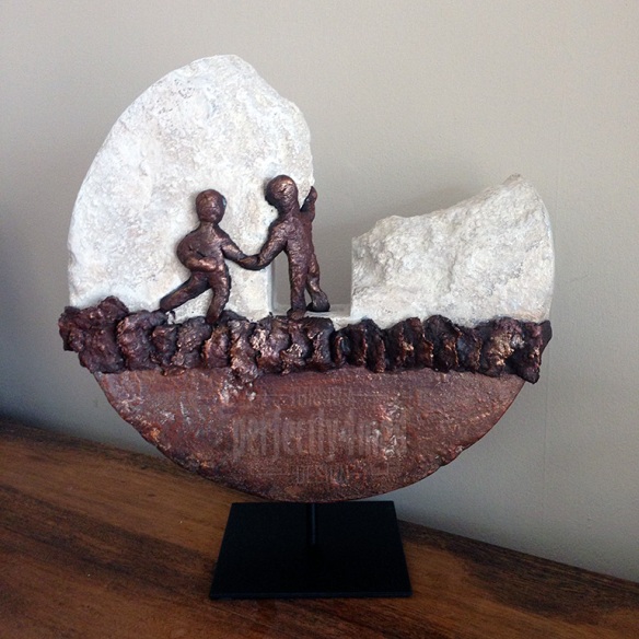
I spent yesterday getting more training in the use of the versatile fluid hardener, Powertex. This time we concentrated on ‘Stone Art’. Given that there isn’t a single grain of anything even vaguely resembling stone in the project below, it’s a very impressive product!

Powertex Stone Art - first projectThe base is the heaviest part of the project, and also likely to be the only part that isn’t weatherproof. I took the opportunity to get a stack of materials into stock (and find somewhere in the studio to store them!) so I’ll be playing some more as I get some samples ready for workshops later in the year. Thanks to Brit for another cracking training session.


Perfect in Pastels…

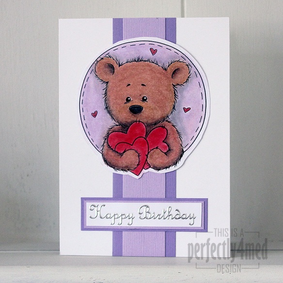
Bundle of Hearts in pastelsIt’s ‘Let’s Celebrate’ theme over at The Crafting Cafe this month, and for my DT post I chose the fantastic ‘Bundles of Hearts’ digistamp from , their sponsors this month.

I had a go at being a bit different, and decided to try and make the equivalent of an embossing folder to build up the image into an embossed one – it worked to a degree, but no where near good enough to run with, and then I ran out of time.

So I got out the PanPastels to colour in Benson Bear, adding shading and filling in the small areas with Derwent soft pastel pencils. I blended those in with a paper stump, which was also quite handy for moving the pastel off the laser-printed black areas. Any pastels running over edges were gently rubbed back with an eraser. I used a spray fixative to seal everything before assembling the card. The sentiment is a peel off, and the coloured card from Bazzill. I love the texture that the pastels give to the fur 🙂

And once I’ve mastered the art of converting a digistamp to an embossed image, I’ll let you know!


Seasonal Colour Palette – Dove of Peace

I like a challenge… and I like it even more when I get inspiration, have the materials, and more importantly can snatch a moment to get the piece done. So it is with some delight that I share with you my entry to the Ranger Ink ‘Seasonal Color Palette’ Challenge: to create any project using the theme colours based around the Adirondack Color Washes in Butterscotch, Meadow, Espresso and Sailboat Blue. It’s a 12×12 inch canvas:
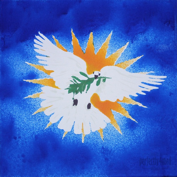
Color Wash Dove

From concept to final outcome took approximately 3 hours, with only two hours of hands-on crafting. I started by using Adobe Illustrator to produce an outline of the starburst, dove and olive branch, printing it out four times. Each copy was then sprayed with fixative spray to seal it, which stopped the colour wash bleeding through. I cut out the various items to produce stencils – the central outline, the eyes and beak, the branch, and then the starburst ‘prongs’. I used repositionable spray glue to coat the back and adhere the stencil firmly to the canvas before spraying each of the colours on in turn, using a heat tool to dry and heat set between colours. Aside from a bit of overspray and bleed, and a little stencil misalignment, I’m quite pleased with the result. I did a little touching up here and there with some of the Distress Paints, which may be hard to see as they picked up some of the dye layers beneath.
College – Term 6 – Final Major Project – another light shade

It’s another light shade, this time featuring cut-outs using silhouettes based on my own observational drawings. I’ve cut the silhouettes from heavy interfacing, used Bondaweb to fuse to a layer of white cotton, and then machine stitched them onto the card frame.


And this afternoon, I spent a couple of hours in a darkened room. The stress hadn’t got to me (though the same can’t be said for our tutor this morning!), but the need to photograph all my creations to date had. Here’s a selection:

lampshadewpheader.jpg

Gelli Print Trio – New Home Cards

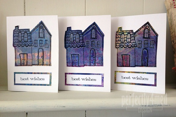
I needed to stay awake yesterday evening, so turned off the TV, got off the sofa and disappeared down the garden to the studio. A couple of friends have recently moved house, so I decided to make them new home cards, which took about an hour (including tidying up after, which I’m determined to keep doing!):

Gelli Trio

The backgrounds are mono prints using my Gelli Arts printing plate, layering up lots of different acrylic paint colours through stencils, sequin waste and removing paint with bubble wrap and foam stamps. I overprinted with white acrylic using the Claudine Hellmuth ‘Dwelling’ foam stamp, then outlined with her clear stamp set and Archival Jet Black ink. The sentiment is from Tim Holtz/Stampers Anonymous  ‘Simple Sayings’ [CMS155] printed in Archival Jet Black and mounted on background offcuts to tie it all together. I outlined areas using a Signo white gel pen (fine tip) just to help define some of the detail.

Another blog milestone reached!

In just over two years, I’ve had 200,000 views of my ickle bit of the blogosphere! Thank you all!

As promised, my next giveaway will be at 250,000 views, so keep checking in – hopefully I’ll have time to make what I have planned to giveaway before then… Also keep your eyes peeled for a new diary list of workshops in my new studio. It’ll be starting with a ‘Bottle Cap Memories’ session, so start looking out those precious moments.


Quick mixed media tags

I’ve got into the studio at last to do my own thing in between some craft room reconfiguration and college work! I’ve chosen to do some quick mixed media tags using mainly Ranger/Tim Holtz products:

Continue reading

College – Term 5 – Final Major Project – another paper craft light shade

Well after a flurry of activity over the last two weeks watching my new studio get installed, and then decorating it, constructing furniture and moving in – as well as emptying out and putting back to right the dining room, conservatory and some of the craft room – I have my first ‘working’ day in the studio.

Of the various things I have to catch up with, college work is one priority as I have a mid-way assessment tomorrow. Consequently, I have taken pics of my latest light shade in my series. This one features one of the patterns I gleaned from a visit to the Islamic artefacts at the British Museum, drawn into Illustrator, adapted for the round and then screenprinted in opaque white ink onto thick tracing paper, and then constructed onto a card frame. As with the previous post, here are photos of the shade in daylight, and internally lit at night.

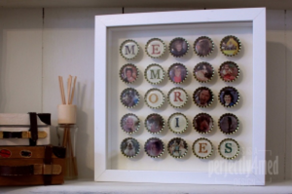
Bottle Cap Memories

It’s Altered or Recycled theme this month over at the WOW! Embossing Powder Challenge blog. This is what I came up with for my design team submission. I need to make an admission – my intention was to use recycled beer bottle caps for this project, but I’ve not had bottled beer for a little while and ran out of time to collect any from the pub… So the project has switched from ‘recycled’ to ‘altered’!

Do you find pouring resin too expensive? Or takes too long to set? Me too, so I came up with an alternative: I’ve used molten WOW! Clear Gloss Ultra High to create the domed glazing in each of the bottle cap frames, and WOW! Earthtones to colour the stamped lettering. Hope you like it, and more details on how to make your own are here.

I’m also happy to accept commission requests if anyone would like one made – all you’d need to do is provide the digital photos/scans. Email me if you’re interested.